
read file error: read notes: is a directory 2021-10-13 22:28:32 Author: portswigger.net(查看原文) 阅读量:85 收藏

-
Published: 13 October 2021 at 13:28 UTC
-
Updated: 13 October 2021 at 13:28 UTC
Recently I've been interested in 3D CSS and I wanted to learn more about it. I was inspired by Amit Sheen's CodePen's and decided to build my own 3D world. This was a great learning experience because I could learn about all the properties and have a clear goal in mind so it pushed me to find ways of constructing it.
In this post, we're going to show you how to create a first person browsable 3D world using pure CSS! Absolutely no JavaScript! You'll learn how to place and move objects in 3D space, and how to create rudimentary interactivity using the keyboard and mouse.
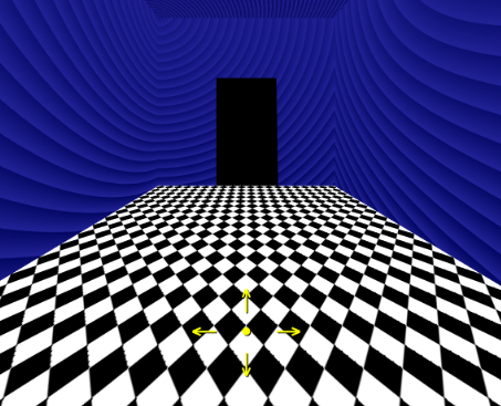
You might be wondering why just CSS? Simply because limitations are fun and can help you find ways of doing things that you didn't expect and push the boundaries of what is possible. It also helps you gain a deeper understanding of the subject. Here's what we are going to work towards:
First of all we need to create our walls and floor in order to create our 3D room. We'll also create a scene to contain all of our 3D world:
<div class="scene">
   <div class="frontWall"></div>
   <div class="leftWall"></div>
   <div class="rightWall"></div>
   <div class="floor"></div>
</div>
Next we need to add some styles for our scene:
<style>
.scene {
   position: relative;
   transform-style: preserve-3d;
}
</style>
We need to use transform-style to make sure all nodes inside the scene are correctly transformed in 3D space. Next we need to add some styles to the body:
body {
   background-color: #000;
   min-height: 100vh;
   display: flex;
   justify-content: center;
   align-items: center;
   font-size: 40px;
   perspective: 10em;
   perspective-origin: 50% calc(50% - 2em);
   overflow: hidden;
}
We want our scene horizontally and vertically centered. We'll manipulate how zoomed out our scene is using the perspective property. To change where the viewer is looking, we use the perspective-origin property. In this case we want the viewer to look at the scene 50% horizontally and 50% vertically minus 2em. We use em's as a convenient way of storing dimensions of our objects as they act like variables, and we can adjust the overall size of our scene by simply changing the font size.
Onto the exciting stuff - we are going to create our front wall now. We're going to be using background gradients using the following tool - but feel free to use images instead:
.frontWall {
   position: absolute;
   background-color: #222297;
   background-image: repeating-radial-gradient( circle at 0 0, transparent 0, #222297 1em ), repeating-linear-gradient( #03076055, #030760 );
   width: 20em;
   height: 20em;
   top: -16em;
   left:-10em;
   transform: translateZ(-10em);
  }
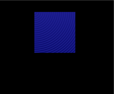
We need to make the wall position absolute so we can place it correctly in the scene, all our walls are going to be 20x20 em. The transform property allows us to move objects around in 3D space, in this instance we're moving the z-axis - which means the object will move forward, away from the viewer.
Since all the walls are going to have the same background we can reuse this rule for the other walls. So replace the .frontWall class with .frontWall, .leftWall, .rightwall like this:
.frontWall, .leftWall, .rightwall { /*previous code goes here*/ }
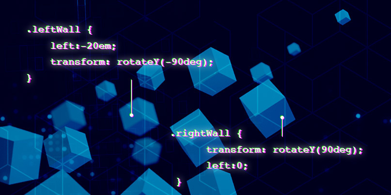
Let's do the left wall now, we again need to place it so it fits nicely in the scene. This time instead of using the z-axis to move it forward, we instead rotate it around the y-axis, so we replace the transform property and rotate it:
.leftWall {
   left:-20em;
   transform: rotateY(-90deg);
}
Time for the right wall, here we rotate along the y-axis the other way and set the left property to 0:
.rightWall {
   transform: rotateY(90deg);
   left:0;
 }
Now the floor, we are going to use a different gradient for it but feel free to choose your own, or another graphic.
.floor {
   background-color: #000;
   background-image:  linear-gradient(135deg, #ffffff 25%, transparent 25%), linear-gradient(225deg, #ffffff 25%, transparent 25%), linear-gradient(45deg, #ffffff 25%, transparent 25%), linear-gradient(315deg, #ffffff 25%, #000 25%);
   background-position:  1em 0, 1em 0, 0 0, 0 0;
   background-size: 1em 1em;
   background-repeat: repeat;
   width: 20em;
   height: 20em;
   top: 1em;
   z-index: 0;
   position: absolute;
   transform:
     translate(-50%, -50%)
     rotateX(90deg)
     translateZ(-3em);
}
We give the floor the same dimensions as the walls, but this time we move it -%50 along the x-axis and y-axis, and rotate by 90 degrees along the x-axis. Finally, we move it closer to the viewer by moving the z-axis -3em.
Great, let's take a look at what it should look like:
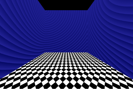
As you can see we are missing a ceiling - so we need to update our CSS rules:
From:
.frontWall, .leftWall, .rightWall { /*existing CSS code*/ }
To:
.ceiling, .frontWall, .leftWall, .rightWall { /*existing CSS code*/ }
Then we need to add another rule for the ceiling and set the left and top to zero. We rotate the ceiling along its x-axis and move it away from the view by using translate Z. Use translate to move the x-axis and y-axis -50%. We also gave the ceiling a darker tint than the walls with a background colour and background image.
.ceiling {
   background-color: #0a0a5c;
   background-image: repeating-radial-gradient( circle at 0 0, transparent 0, #222297 17px ), repeating-linear-gradient( #03076055, #030760 );
   top:0;
   left:0;
   transform:
     translate(-50%, -50%)
     rotateX(90deg)
     translateZ(15em);
}
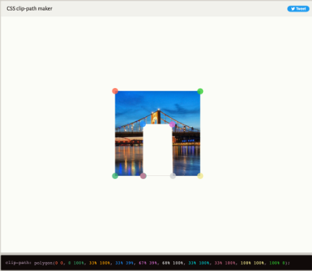
Now to create a doorway. All you need to do here is to use a clip path and add it to the front wall. Using this technique you can create doors and open and close them to go into different rooms:
.frontWall {
   clip-path: polygon(0% 0%,
     0% 100%,
     33% 100%,
     33% 39%,
     67% 39%,
     68% 100%,
     33% 100%,
     33% 100%,
     100% 100%,
     100% 0%);
 }
You can create your own clip paths using this fantastic online tool called Clippy. We need so many points to define a doorway because you have to create the inverse of a rectangle. Using the frame shape is a good place to start.
It's going to get more fun now - our next job will be to create some animations and interaction. To do this we have to use CSS animations. In CSS, you have both transitions and animations available. Transitions are useful when you want to make an element gradually change its properties to another state and back again - for example a door opening on a mouse hover, or a checkbox checked state. Animations are more useful when you want to move an element without relying on a hover or checked states - and they can perform many different operations along the timeline.
First let's define some CSS variables. Place these at the top of the styles, because they are global variables:
:root {
   --turnSpeed: 40s;
   --speed: 300s;
}
--turnSpeed controls how fast you move left and right and --speed controls the forward and backward velocity. Next we need to define the animations:
@keyframes sceneRotateRight { @keyframes sceneMoveForward { @keyframes sceneMoveBack {@keyframes sceneRotateLeft {
to { transform: rotateY(-360deg); }
}
to { transform: rotateY(360deg); }
}
to { transform: translateZ(1000em); }
}
to { transform: translateZ(-1000em); }
}
To define an animation you need to use the @keyframes keyword, followed by the name of the animation. The animation name has curly braces and inside that we need to define what our animation does. In this case we use the "to" selector to assign the transform property, "to" means what the ending keyframe should do - so all other keyframes will gradually manipulate the property until the end value.
We use rotateY to rotate the scene left and right by supplying positive or negative degrees. We have to give the translateZ to move forward and back a big number, because we want to be able to move forward a lot if the user is holding down the key (or clicks the arrow navigation we are going to define).
Now we need to assign the animations. We need to update the scene class and add the animation property. The animation property allows you to define multiple animations and separates them with a comma. We use our variables that we previously defined to control the turn speed and velocity. The animation play state property is very powerful; it lets you pause all the animations until they are ready to run, and choose which to play based on some interaction.
.scene {
   animation:
     sceneRotateLeft var(--turnSpeed) infinite linear,
     sceneRotateRight var(--turnSpeed) infinite linear,
     sceneMoveForward var(--speed) infinite linear,
     sceneMoveBack var(--speed) infinite linear;
   animation-play-state: paused, paused, paused, paused;
}
Next is the navigation - we need to use some anchor elements to allow us to navigate. It's important to place these elements within the same line (sibling) as the scene element. So they can't be a child of another element and must occur before the scene element. This is because we want to play an animation based on interaction with the anchor elements. Let's create the anchors:
<a tabindex="1" accesskey="W" class="moveForward" id="moveForward" href="#moveForward" ></a>
<a tabindex="2" accesskey="A" class="turnLeft" id="turnLeft" href="#turnLeft"></a>
<a tabindex="5" accesskey="X" class="stop" id="stop" href="#stop"></a>
<a tabindex="3" accesskey="D" class="turnRight" id="turnRight" href="#turnRight"></a>
<a tabindex="4" accesskey="S" class="moveBack" id="moveBack" href="#moveBack"></a>
...
<div class="scene"></div>
To do the interaction we need to use the :target selector. The :target selector allows us to select an element based on the hash of the URL. For example if you visit url.html#moveForward then it will target the element with the id "moveForward". We also need to give the elements a class so we can make sure the correct animation is played since the :target selector only allows you to target a specific id. Then we need to change the animation state based on the focus state or URL:
:target.turnRight ~ .scene, #turnRight:focus ~ .scene { :target.moveBack ~ .scene, #moveBack:focus ~ .scene { :target.moveForward ~ .scene, #moveForward:focus ~ .scene { #moveForward, #turnLeft, #stop, #turnRight, #moveBack {:target.turnLeft ~ .scene, #turnLeft:focus ~ .scene {
animation-play-state: running, paused, paused, paused;
}
animation-play-state: paused, running, paused, paused;
}
animation-play-state: paused, paused, paused, running;
}
animation-play-state: paused, paused, running, paused;
}
position: absolute;
left: -5000px;
top:-5000px;
}
Notice that ~ in the selector this is the general sibling selector and it will find any sibling of the element selected. This is why we needed to place the controls before the scene and within a sibling. We also move the controls off-screen - which will prevent the browser from focusing on them. The access key attributes on the anchor elements allow you to assign shortcuts. On a Mac the combinations are CONTROL+ALT+W to move forward and SHIFT+ALT+W on windows. The other keys are A to turn left and D to turn right, S to move back and X to stop.
Finally we need to add some clickable controls. All you need to do is create some more anchors that point at the correct target:
<div id="controls">
<div class="flex-grid">
<div class="col"></div>
<div class="col"><a href="#moveForward">↑</a></div>
<div class="col"></div>
</div>
<div class="flex-grid">
<div class="col"><a href="#turnLeft">←</a></div>
<div class="col"><a href="#stop">•</a></div>
<div class="col"><a href="#turnRight">→</a></div>
</div>
<div class="flex-grid">
<div class="col"></div>
<div class="col"><a href="#moveBack">↓</a></div>
<div class="col"></div>
</div>
</div>
We use various arrows and a circle for the stop link. We finish off by adding some styles - and the Safari hack is used to change the position of the arrows so they will work correctly on that browser.
.flex-grid { .col { #controls a:link, #controls a:visited {/*Safari only hack*/
@supports (-webkit-backdrop-filter: blur(1px)) {
#controls {
top: 40%;
}
}
display: flex;
justify-content: space-between;
align-items: center;
justify-content: center;
}
width: 32%;
text-align: center;
}
text-decoration: none;
color:rgb(250, 255, 0);
text-shadow: 2px 2px #000;
}
That's all the CSS you need to create a basic first-person 3D world. We hope you've enjoyed this tutorial and we hope to inspire you to create your own. If you want to view the whole source you can grab the completed file from Github or view the final result online.
To take it a stage further, you can design multiple rooms and connect them together and use doors that open and close. We'd love to see your creations, please tweet us and we'll RT the best ones.
如有侵权请联系:admin#unsafe.sh