
BRBito started from a familiar experience in our own remote work: getting deeply focused was rarely 2026-10-1 23:52:46 Author: hackernoon.com(查看原文) 阅读量:19 收藏
BRBito started from a familiar experience in our own remote work: getting deeply focused was rarely the hard part. The hard part was deciding when to interrupt that focus. You look up and an hour is gone… Then another. You know you should move, get some water, look away from the screen, or simply give your brain something different to do for a moment, but when you are already “in the zone,” taking a break can feel more like an interruption than a reward.
Our original question for Shipaton became: “Could taking a break feel less like an interruption, and more like a tiny moment you'd actually look forward to?” Six weeks later, that question had shaped everything from our user research and notifications to our visual design, technical architecture, and eventually, the way we chose to monetize the app.
We initially thought the problem was reminders
Our first assumption was “people get absorbed in what they are doing and forget to take breaks, so maybe we just needed to build a better reminder”, but research complicated that idea very quickly. In a small exploratory survey with 22 participants, 18 reported spending at least three hours a day with little movement.
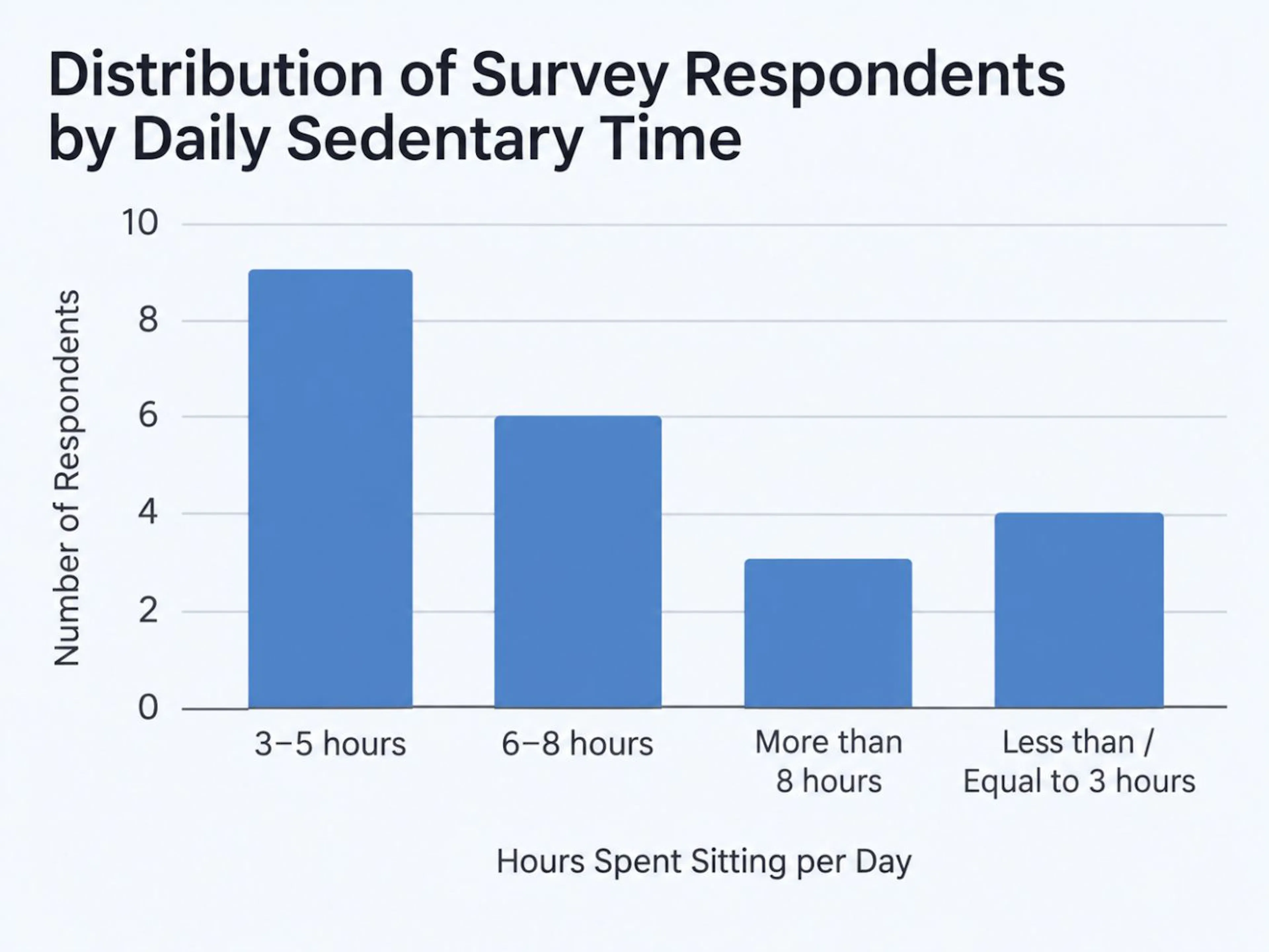 Most respondents reported spending between 3 and 8 hours sitting each day.
Forgetting was common, and losing track of time was common too, but 11 participants also told us they sometimes avoided taking a break because they did not want to interrupt their concentration.
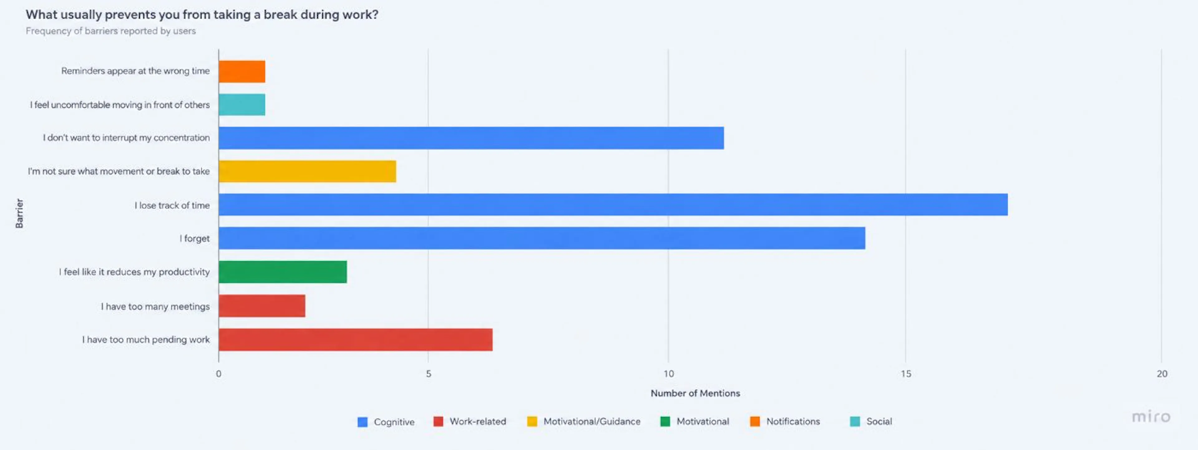 The main barriers weren’t about unwillingness to take a break, but about losing track of time and staying focused on work.
That distinction mattered, because the problem wasn't simply “People need to be reminded”. It was closer to: “People may know that a break could be useful, but the timing — and the cost of interrupting themselves — matters”.
We found another warning sign: Twenty-one of the 22 participants said too many notifications could make them stop using a tool like this. Small sample? Absolutely. We weren't treating 22 responses as proof of a universal behavioral pattern, but it was enough to challenge our initial direction. If we solved “people forget” by building another notification-heavy app, we could end up solving one problem by creating another.
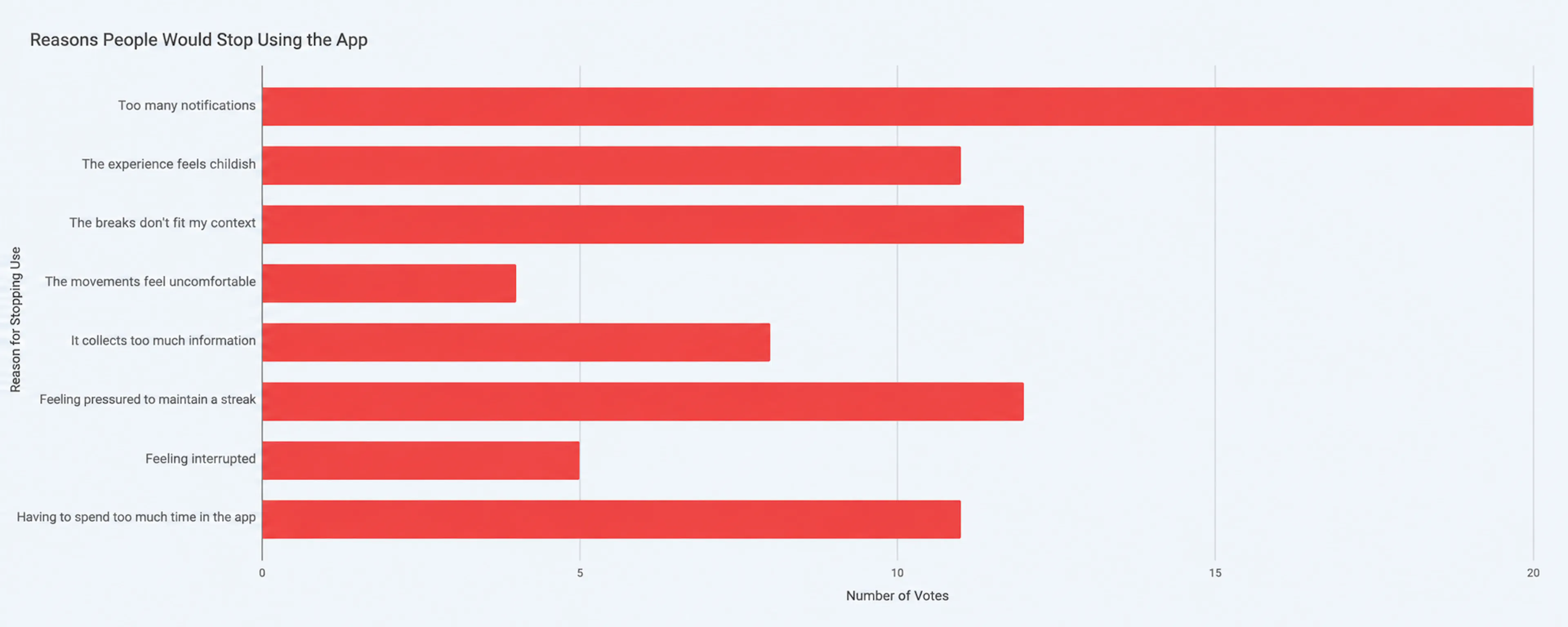 People need help remembering to take breaks—but they don’t want another app constantly interrupting them.
So we stopped designing a reminder and started designing permission
That became a core part of the product: BRBito shouldn’t announce that it’s time for a break. It should ask whether this is a good moment for one. People choose the days BRBito can appear, their active hours, reminder frequency, and the kinds of pauses they prefer, so when a reminder arrives, the answer does not have to be yes: it can be now, later, or not now.
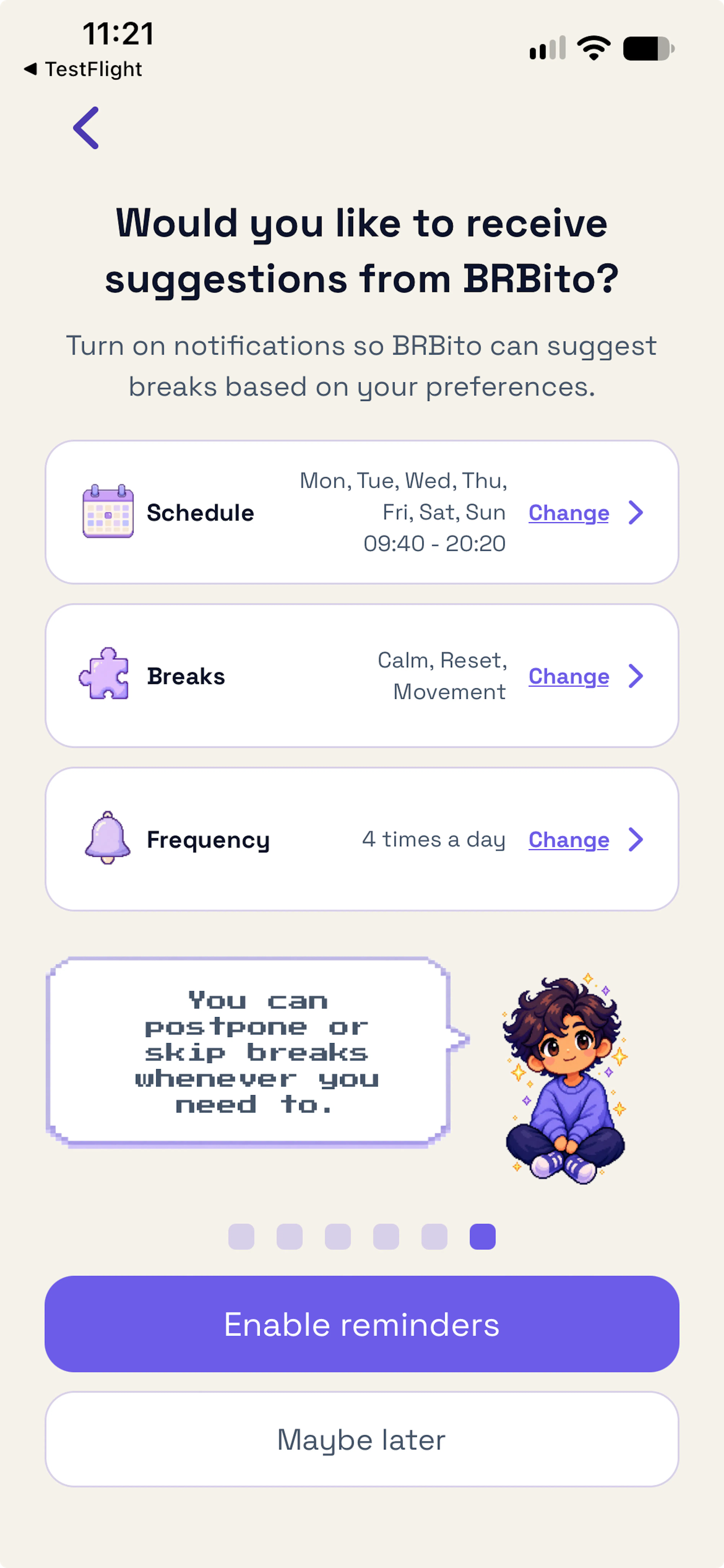 Permission priming gives users context and control before notifications are enabled.
Nothing breaks if the answer is no. No streak disappears, no warning turns red, no mascot looks disappointed. This eventually became an internal writing rule for the product: Before a break, BRBito invites. During a break, BRBito guides. After a break, BRBito lets go. That last part became especially important because we did not want to build a break app that asked people to spend their break interacting with another app.
The best BRBito session is surprisingly short
A BRBito pause is intentionally small. The app suggests an activity, shows a timer, and gives the user the option to finish early. When the pause ends, the experience ends too. There’s nothing else competing for your attention — no feed to scroll, no streak to protect, no extra screen trying to keep you there.
We still need to understand retention. We still need people to find enough value to use BRBito again. And if we want to keep developing it after Shipaton, the product eventually needs to sustain itself, but it changed what we wanted retention to mean. For BRBito, a successful interaction might be: notice → decide → pause → leave; instead of: open → interact → browse → reward → keep interacting. That distinction ended up influencing almost every decision that followed.
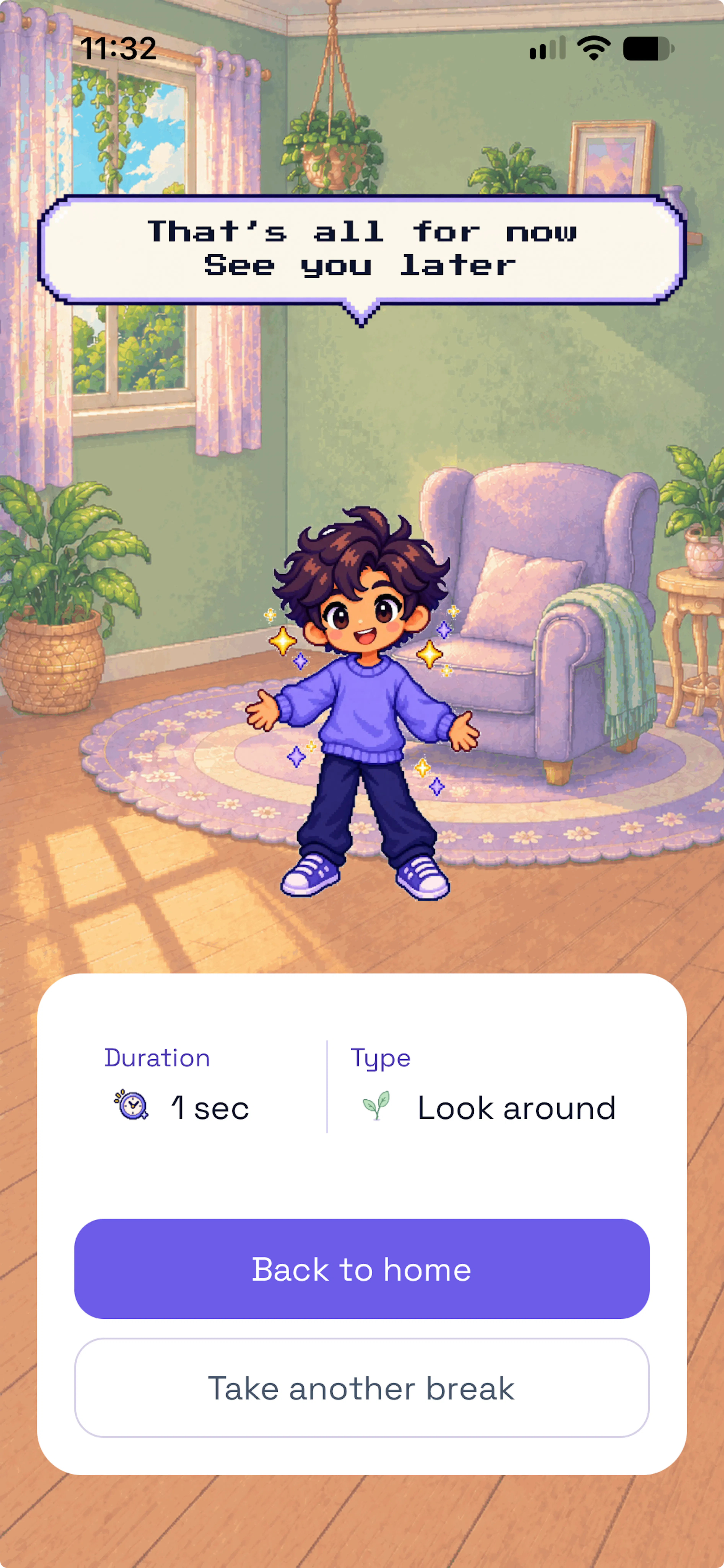 A lightweight ending helps users acknowledge the break without adding more screen time.
Miro made the product look much simpler than it was
By the time we moved into implementation, BRBito already felt fairly complete in Miro. We made use of AI to accelerate those visual explorations, and had mapped the onboarding, Home, notifications, the pause flow, the timer, and the completion state. From a distance, it looked like a straightforward sequence of screens. However, building it revealed something very different.
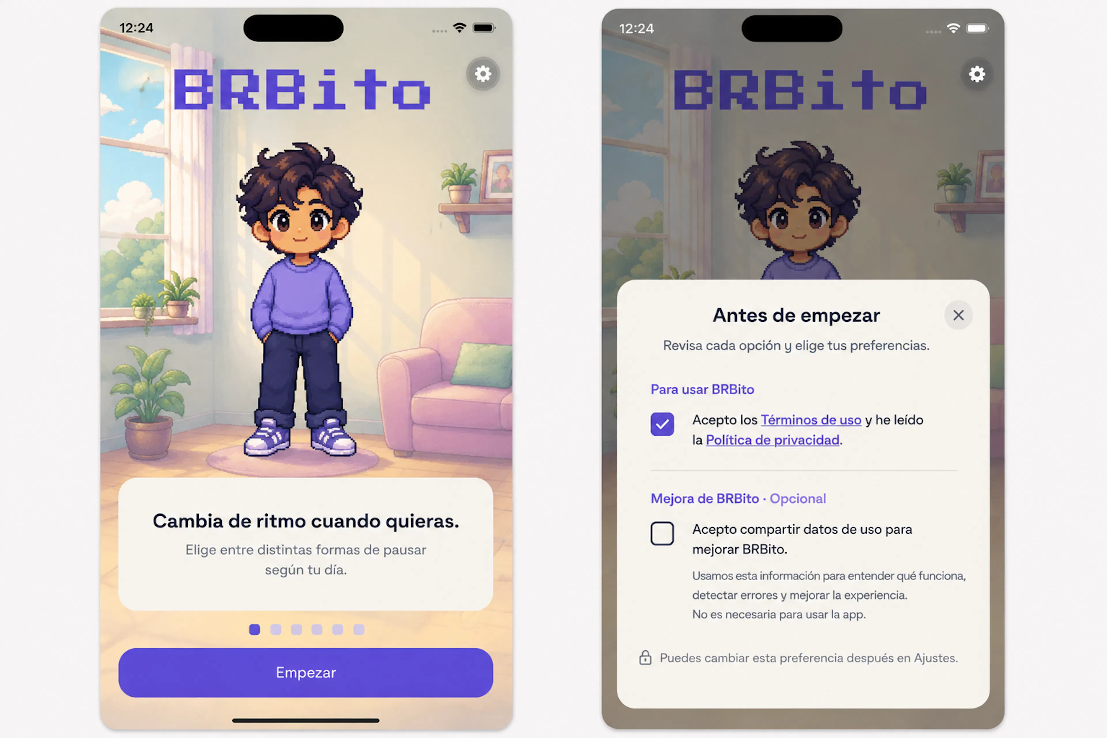 Our first explorations focused on finding the right balance between personality, simplicity, and user control.
A pause could begin from a notification or directly inside the app. Someone might leave midway through it, come back later, finish early, ignore a reminder entirely, or change their schedule while other notifications were already planned. The app itself might be closed, reopened, or sent to the background, while notification permissions and operating-system behavior could change around it. What looked like a screen-design problem quickly became a synchronization problem.
We had to keep three things aligned at all times: what the person did → what BRBito stored → what BRBito shows
For this first version, keeping the core experience local gave us the simplest foundation. MMKV stores preferences and pause state directly on the device, while local notifications are scheduled around the days, hours, and frequency each person selects. We also considered OneSignal, but the essential reminder flow was already covered. Adding another notification system at that stage would have brought more implementation, testing, and privacy considerations without solving an immediate MVP need.
That became a recurring lesson throughout the Shipaton: a technology can be useful without being necessary right now.
One codebase did not mean one experience
React Native and Expo let us share most of BRBito’s code between iOS and Android, but shared code did not automatically produce identical experiences. Differences started appearing in places that seemed minor at first: time pickers, keyboard behavior, spacing, navigation controls, notification permissions, and accessibility settings. Each one required its own adjustment.
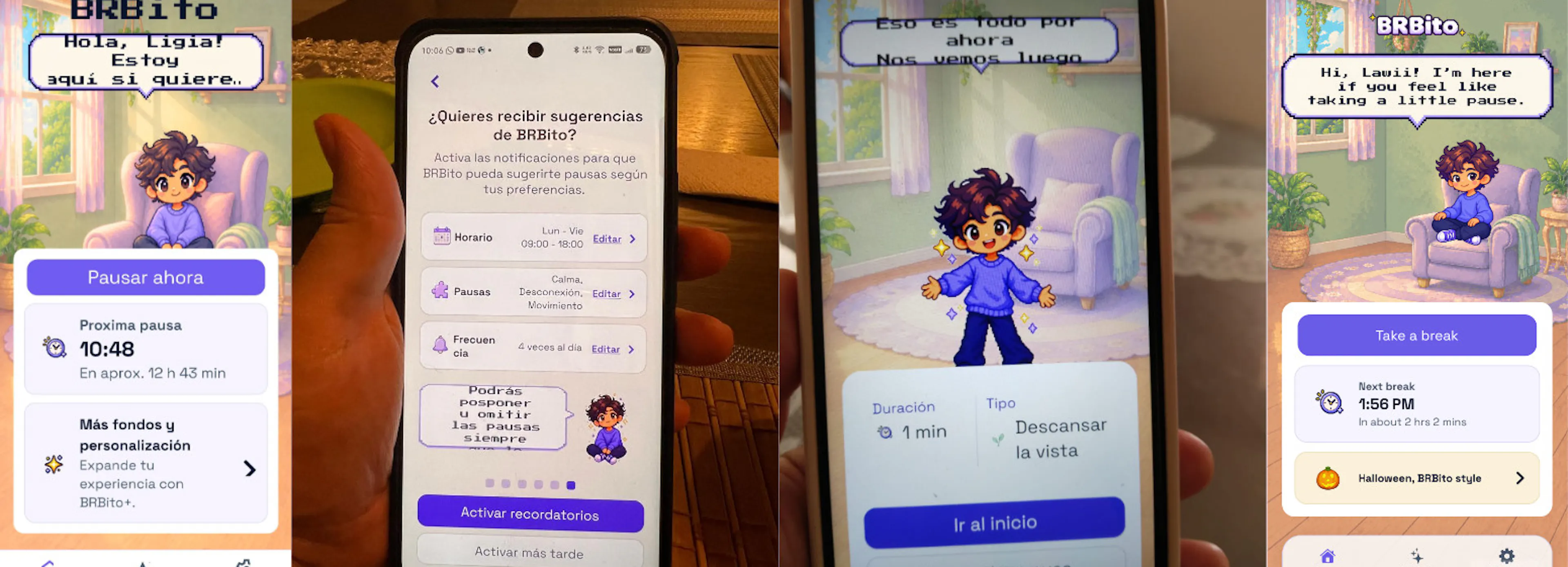 Different devices exposed different problems, from spacing and scale to readability and visual balance.
Typography gave us one of the clearest examples. We had chosen a pixel-style typeface because we thought it fitted BRBito’s visual personality well, and on the iPhone we were using for most of our early testing, it looked exactly as intended. On smaller Android screens, however — particularly when accessibility text was enlarged — some of those friendly little speech bubbles could no longer contain the copy.
The solution was not simply to make the text smaller. We had to reconsider both the font and how flexible the component itself needed to be. That was a reminder that visual polish in a mockup is only the beginning; the real test is whether the design still works under actual constraints.
Pixel art also forced an architectural change
Our early implementation sometimes treated the environment and character almost like one finished composition. That worked while BRBito had one room and one companion, but when we started bringing personalization back into the product, we knew duplicating complete compositions would have become painful very quickly. So we separated the visual experience into layers: environment → companion → interface
The same environment can now support different character states, and companions can change without rebuilding the entire screen. What began as a small change in how we structured the screen became a useful lesson about growth: the second time you need the same kind of solution is often the moment to ask whether you should stop patching individual cases and start designing a system around them.
Then we had to answer the uncomfortable question: what do we charge for?
We had plenty of monetization ideas: a customization store, multiple companions, accessories, more environments, collections. subscriptions, advertising… Besides, like many hackathon teams using AI-assisted tools, we initially thought we could build more of it than we actually could. AI did make exploration dramatically faster, so we generated alternatives, tested visual directions, explored copy, and moved through ideas much faster than we otherwise would have.
For a while, that speed made the possible scope feel larger than it really was, but he gap became obvious once those ideas had to move beyond exploration. A generated possibility still needed to become a product decision; that decision needed to become an implementation; and the implementation still had to survive QA, accessibility, store requirements, and two platforms. Exploration had accelerated, however, shipping had not accelerated at the same rate. As the deadline got closer, monetization became less about how much we could add and more about what actually made sense to charge for. For us, the core break experience wasn’t it.
Our first monetization experiment is intentionally optional
We wanted reminders, pauses, and the basic BRBito experience to remain free, so rather than putting more of that core loop behind a paywall, we chose visual personalization as our first paid experiment. That led to a small, one-time Halloween Pack with three seasonal environments and a new companion, Batito. The base room and Classic BRBito remain available without paying.
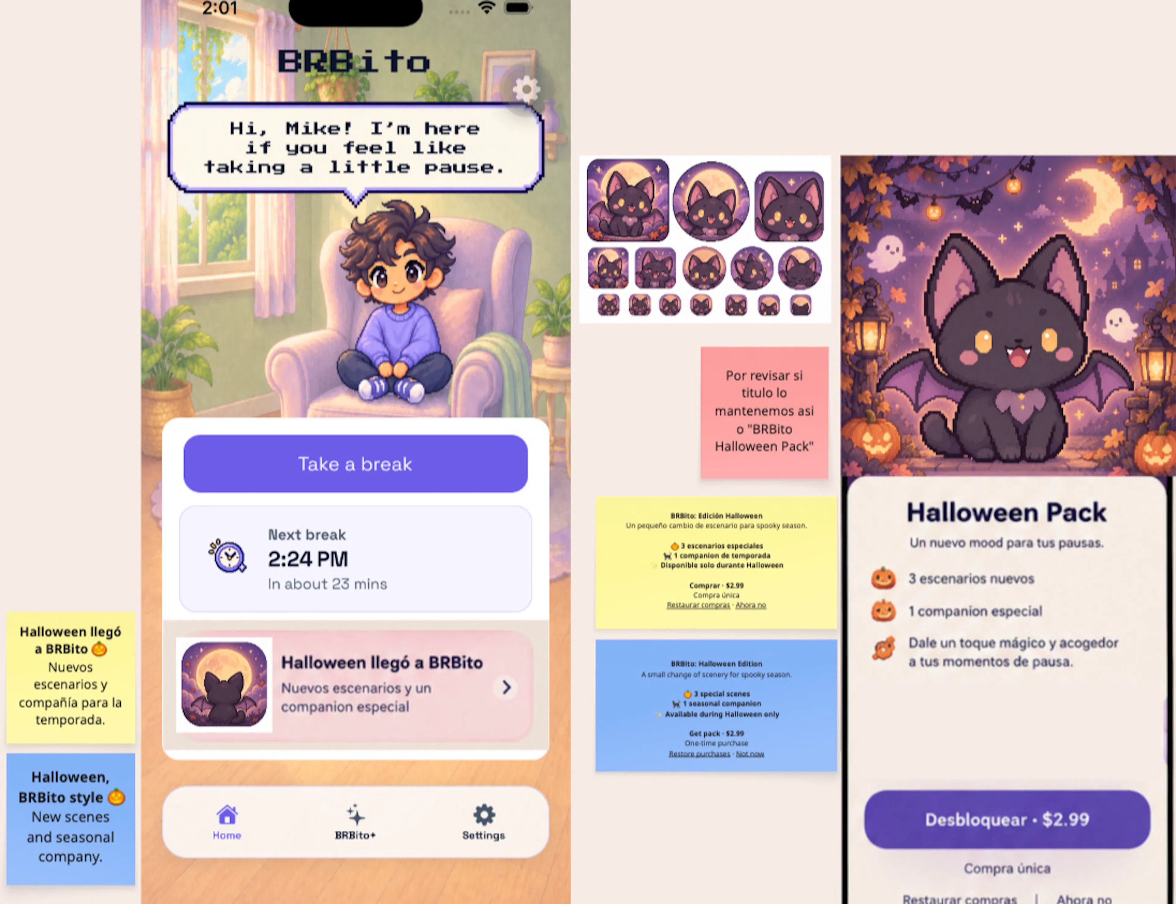 Our first monetization experiment focused on optional seasonal content rather than putting the core experience behind a paywall.
We are not treating seasonal packs as a proven business model. At this stage, they are simply a hypothesis we can put in front of real people and learn from. More importantly, the approach lets us experiment with monetization without turning the pause itself into something that requires a subscription. RevenueCat handles the purchase flow and premium access.
From the outside, the flow looks almost trivial: locked content → paywall → purchase → unlock; however, the behavior underneath it is not. A paywall can start closing before a purchase result is confirmed. Someone can cancel, encounter an error, leave a transaction pending, reinstall the app, or need to restore access on another device. That meant premium content could not simply unlock when someone tapped a button.
BRBito waits for RevenueCat to confirm the purchase before granting access. When the app launches or returns to the foreground, it checks that access again. If a previously confirmed purchase cannot be verified temporarily, we preserve the last known valid state rather than immediately taking away something the person already paid for. Restore Purchases became part of the flow for the same reason: buying something is only one part of the experience. Being able to recover and continue using it matters too. This was another case where the simplest-looking screen hid the more interesting engineering problem.
Building in public made our uncertainty visible
Throughout the Shipaton, we shared much more than the polished outcome. We wrote about early research, visual identity, naming, content decisions, implementation problems, scope cuts, and what happened when the product moved from Figma into a real app. None of that replaced user research, and we did not treat public reactions as if they did. Sharing the process served a different purpose: it forced us to explain our reasoning while many of the decisions were still unfinished.
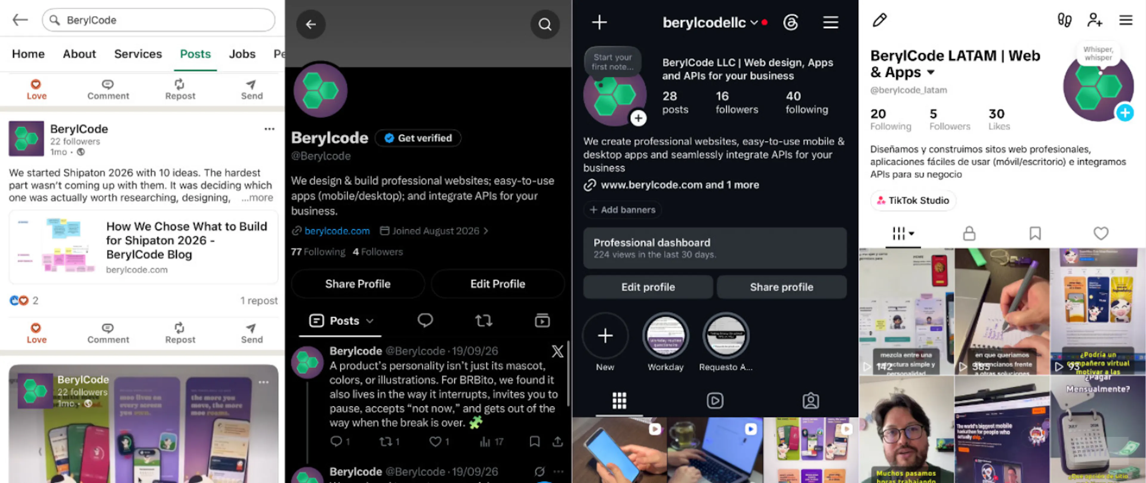 Across platforms, we shared BRBito’s progress, decisions, and lessons as the product evolved.
Why no streaks? Why pixel art? Why reduce the pause library? Why skip some of the notification systems we had explored? Why keep the core break free? Questions like those sound easy to answer when everyone on a small team already knows the context. Writing the answers down made vague reasoning much harder to hide. If BRBito continues beyond the Shipaton, that record may end up being one of the most useful artifacts from these six weeks. We do not only have the product as it exists today; we also have a trail of decisions showing how and why it became this product.
Starting the same six-week process again would probably change 3 things.
This was our first Shipaton and, although everyone at BerylCode brings years of experience working on digital products, BerylCode itself is still a young company. It was also the first time we had taken a product through this entire process together — from research and product decisions to design, development, store submission, monetization, and sharing the process publicly.
The first is interface architecture. We would define reusable structures earlier instead of allowing some components to become too closely tied to their first visual state. That would make later variations easier to build and maintain.
The second is planning for the app stores earlier. We learned that “the app works” and “the app is ready to ship” are two very different milestones. Testing, screenshots, privacy requirements, metadata, product configuration, and review cycles all need to be planned alongside development, not after it.
The third is scope. AI genuinely helped us explore faster, but we would be more careful about translating that speed into assumptions about how much we could actually ship. Generating ten possible directions quickly does not remove the work that comes afterward: choosing one, making it coherent, implementing it, testing it, and deciding whether it belongs in the product at all.
Going through the full process for the first time as BerylCode made those tradeoffs much more visible — and gave us a much clearer sense of what we would plan differently next time.
The smallest BRBito we could actually ship
The BRBito we imagined at the beginning was much bigger: more pause types, more companions, more environments, more customization, and several monetization ideas. However, the version we are shipping is smaller, but it is also more defined. BRBito knows when it is allowed to appear and remembers the preferences people choose. It can suggest a pause without demanding one, recover an active session if someone leaves, and let them finish early if they want to. Once the interaction is over, it is comfortable getting out of the way.
Six weeks ago, BRBito was only one of several ideas we were considering. It moved from research into flows and illustrations, then into code, notifications arriving on real phones, purchases, and store submissions. We did not build everything we imagined, and that was ultimately not the most important lesson. What mattered the most, for us, was learning what needed to exist first. For a product designed to ask for less attention, ending up with something smaller may have been exactly the right outcome.
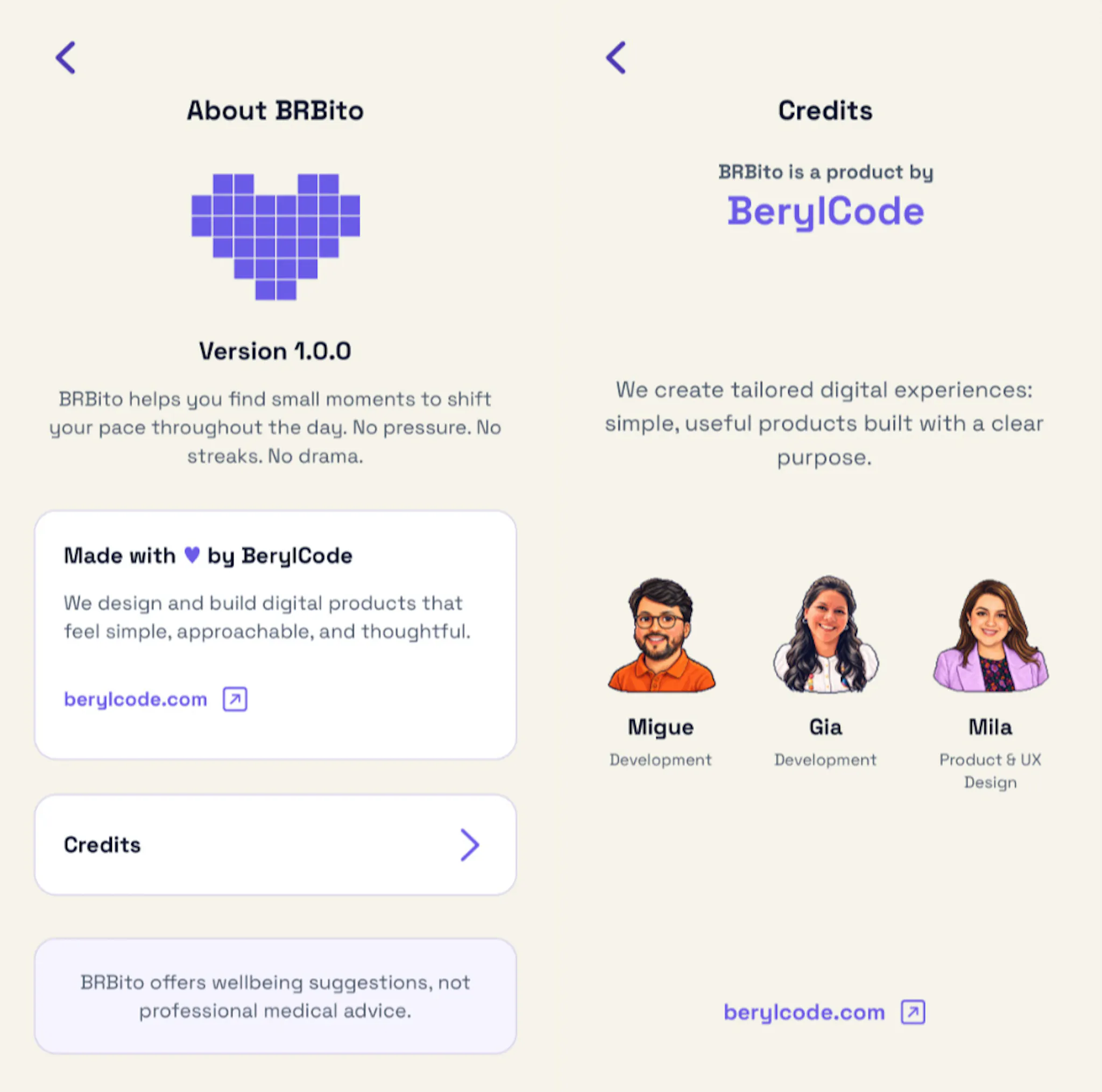 BRBito is a BerylCode product, built by a small team and shaped with care from end to end.
Thanks to everyone who followed the process, shared feedback, tested BRBito, or supported us along the way. It made these six weeks even more meaningful.
如有侵权请联系:admin#unsafe.sh