
The Fogg Behavior ModelWhy This Matters to YouImagine you've spent weeks designing a feature. You 2026-8-15 20:46:53 Author: hackernoon.com(查看原文) 阅读量:14 收藏
The Fogg Behavior Model
Why This Matters to You
Imagine you've spent weeks designing a feature. You launch it — and crickets. Nobody uses it.
Sound familiar?
The problem might not be bad design. It might be that your users simply weren't set up to take the action you wanted.
This brings us to the Fogg Behavior Model.
Created by Dr. BJ Fogg at Stanford University, this framework has been cited in over 1,900 academic papers and adopted by product teams worldwide. It's also one of the simplest frameworks in design. Five minutes to explain. Lifetime to master.
By the end of this article, you'll be able to:
- Predict when users will perform a behavior
- Diagnose why a feature isn't being adopted
- Apply practical fixes to your designs immediately
This is the first installment of UX Unpacked — a series where I break down essential UX concepts, one framework at a time. Each piece stands alone while building toward deeper fluency. No jargon dumps. No gatekeeping. Just clarity.
Let's begin.
The Core Formula: B = MAP
Here's the entire model in one line:
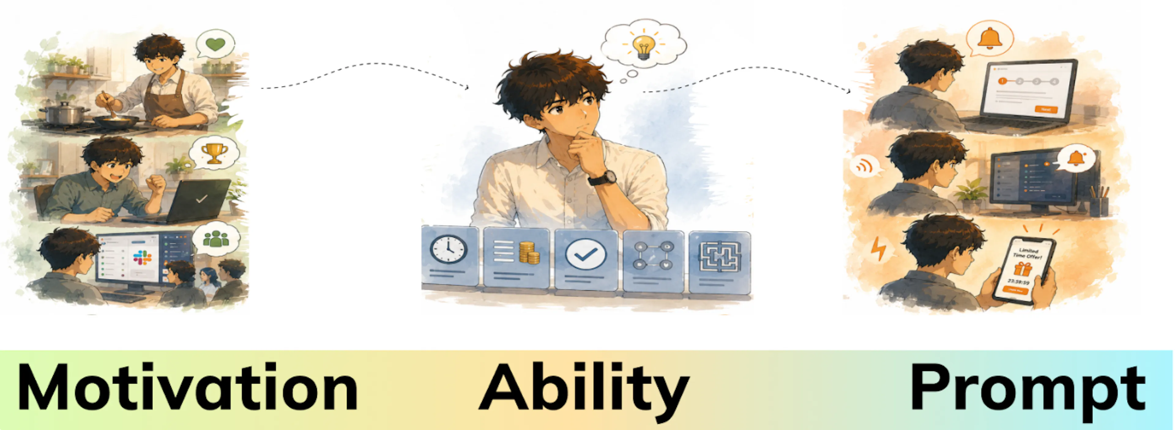
Behavior = Motivation × Ability × Prompt
Or, translated into plain English:
A behavior happens only when Motivation, Ability, and a Prompt all align at the same moment.
If any one of these three pieces is missing, nothing happens.
No complexity. No hidden variables. This is the ceiling and the floor.
The Three Ingredients
1. Motivation — Do I want to do this?
Motivation is your user's desire to perform an action. The catch: motivation fluctuates wildly. A user who's highly motivated today might be unmotivated tomorrow.
Three sources of motivation:
|
Type |
What It Means |
Example |
|---|---|---|
|
Person |
Internal desire |
I love cooking, so I download recipe apps |
|
Advantage |
External reward or consequence |
I complete tasks to earn a bonus |
|
Context |
Environmental influence |
Everyone in my team uses Slack, so I do too |
Design Tip: Don't try to manufacture motivation from scratch. Instead, connect your feature to motivations that already exist in your users' lives.
2. Ability — Can I do this easily?
Ability is about simplicity. Even highly motivated users won't act if something is too hard.
Five factors that make things harder:
- Time — Does it take too long?
- Money — Is it expensive?
- Physical effort — Does it require clicking 20 times?
- Mental energy — Is it confusing?
- Routine fit — Does it disrupt their workflow?
Design Tip: The easiest fix is almost always to reduce friction. Remove steps, pre-fill fields, default to sensible choices.
3. Prompt — Am I reminded to do this?
The prompt is your trigger. Without it, no matter how motivated or able your user is, nothing happens.
Three types of prompts:
|
Type |
When to Use |
Example |
|---|---|---|
|
Facilitator |
High motivation, low ability |
A step-by-step wizard guides setup |
|
Signal |
High motivation, high ability |
A subtle icon reminds them to click |
|
Spark |
Low motivation, high ability |
A limited-time offer nudges them to act |
Design Tip: Prompts should be timely and noticeable — but not annoying. A well-placed button beats an ignored notification.
The Action Line: Where Behavior Happens
Now for the visual that makes it stick.
Imagine a graph showing motivation on the vertical axis and ability on the horizontal axis, with a curved line separating where behavior happens from where it doesn't.
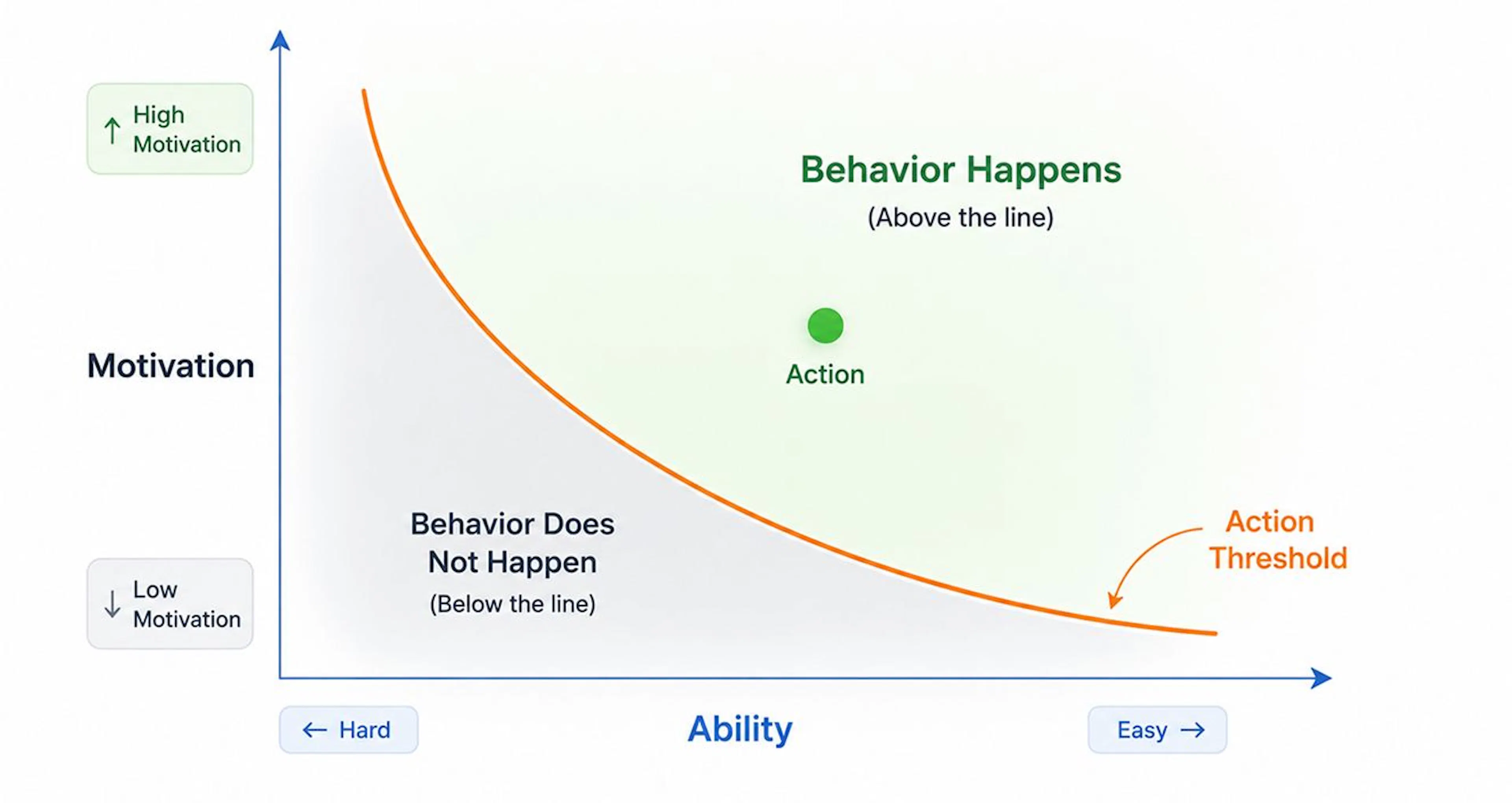
Key insights:
- If a behavior is very easy, you need less motivation
- If a behavior is hard, you need lots of motivation
- Either side of the equation can compensate for the other
What's below the line? Nothing happens. Fix one variable, and you cross the threshold.
How to Debug Missing Behavior (The Right Order!)
When a feature isn't getting adoption, designers often blame motivation. "Users just don't care!"
But that's usually wrong.
Follow this checklist instead:
Step 1: Is there a prompt?
- Can users find the button?
- Do they know when to act?
- Is it clear what happens next?
Fix: Make the prompt visible and well-timed.
Step 2: Is it easy enough?
- How many clicks/taps?
- Are there unnecessary forms?
- Does it fit into their current flow?
Fix: Remove friction. Make it stupidly simple.
Step 3: Only then — do they want to?
- What's in it for them?
- Does it connect to an existing desire?
- Have you removed barriers that kill motivation?
Fix: Tie your feature to real user goals, not business goals.
Remember: Fixing motivation is the last resort. If your prompt is invisible or your flow takes 20 minutes, no amount of excitement will help.
Real-World Example: BeReal
BeReal exploded in popularity by nailing all three ingredients.
|
Ingredient |
How BeReal Delivered It |
|---|---|
|
Prompt |
Daily notification at a random time — surprising and impossible to ignore |
|
Ability |
One photo, under 2 minutes, no editing. Stupidly simple |
|
Motivation |
Authenticity + social connection + FOMO among Gen Z |
Result? Apple's 2022 iPhone App of the Year. All because all three converged.
Apply This to Your Design Today
Pick a behavior you're trying to encourage. Now ask:
|
Question |
Your Answer |
|---|---|
|
Is there a clear, timely prompt? |
Yes / No |
|
Is the action as easy as possible? |
Yes / No |
|
Does the user genuinely want to do this? |
Yes / No |
Any box unchecked? That's your fix.
A Word on Ethics
With great power comes responsibility.
Dr. Fogg himself emphasizes two rules:
- Help people do what they already want to do.
- Help people feel successful.
Avoid dark patterns: fake countdowns, hidden costs, manipulative notifications. Design for user success, not just business metrics. Long-term trust beats short-term wins.
Wrapping Up
The Fogg Behavior Model doesn't promise magic. But it does give you:
- A diagnostic framework for stuck features
- A prioritized checklist for improvement
- A common language for your team
Remember: B = MAP. When a behavior isn't happening, one piece is missing. Find it, fix it, move on.
What's Coming Next in This Series
Upcoming articles will cover:
- Mental models for interaction design
- Hick's Law and decision fatigue
- Jakob's Law and user expectations
- Peak-End Rule for memory retention
- Fitts's Law and target sizing
Each piece builds on the last while standing alone for new readers. My goal is to make these concepts accessible to anyone starting in UX — no jargon dumps, no gatekeeping.
如有侵权请联系:admin#unsafe.sh