
好的,我现在需要帮用户总结一篇文章的内容,控制在100个字以内,并且不需要特定的开头。首先,我得仔细阅读这篇文章,理解它的主要观点。 文章主要讲的是风险优先级矩阵的使用方法。它是一个表格,用来比较不同风险的发生概率和影响程度。作者详细介绍了构建这个矩阵的步骤,包括列出风险、定义评分标准、评估可能性和影响、绘制矩阵、转化为行动以及定期审查等。 接下来,我需要提取关键信息:风险优先级矩阵的作用、构建步骤、评分标准的重要性以及实际应用中的注意事项。这些是文章的核心内容。 然后,我要把这些信息浓缩成100字以内的中文摘要。要注意语言简洁明了,涵盖主要步骤和重要性。比如提到矩阵帮助团队评估风险,结构化讨论,动态调整等。 最后,检查字数是否符合要求,并确保没有遗漏关键点。这样用户就能快速了解文章的主要内容了。 </think> 文章介绍了一种风险优先级矩阵的使用方法,通过评估风险的发生概率和影响程度来帮助团队进行结构化讨论和动态调整风险管理策略。 2026-3-27 01:17:48 Author: securityboulevard.com(查看原文) 阅读量:5 收藏
Key Takeaways
- A risk prioritization matrix gives teams a shared way to compare risks, instead of letting urgency be driven by whoever is loudest or closest to the issue.
- The matrix is useful because it creates structure, but it still depends on judgment, so the scoring only works if the criteria are clear and consistently applied.
- A good matrix should make cross-functional discussions easier, especially when different teams define “high risk” in very different ways.
- Prioritization is only meaningful when it changes what happens next through ownership, response, escalation, or review.
What Is a Risk Prioritization Matrix?
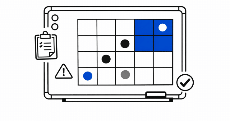
A risk prioritization matrix is a way to compare risks using the concept of a table. The matrix is built like a grid. One side measures how likely the risk is to happen. The other measures how much damage it could cause if it does. Once risks are placed on the grid, it becomes easier to see which ones belong at the top of the list and which ones are lower priority.
The visual appeal is obvious. A matrix simplifies a complicated picture. It gives people a shared reference point for discussing risk, even when they come from different functions and care about different things. A compliance manager, an IT leader, an operations stakeholder, and an executive may not describe risk in the same language, but a matrix gives them a common structure to work from.
Why Organizations Use a Risk Matrix
Organizations use a risk based prioritization matrix because they cannot address every risk at once. Time, people, money, and attention are all limited. If every issue is treated as equally urgent, teams usually end up responding to whatever is loudest, newest, or most politically visible rather than what poses the greatest threat to the business.
This is especially useful in organizations where risk discussions involve multiple functions. A matrix helps create a structure for those comparisons. It is not perfect, but it is usually much better than relying on instinct alone.
Step-By-Step Guide to Building Risk Prioritization Matrix
Step 1: Build a Clean List of Risks
Before you can rank risk, you need a usable list of risks to compare. This sounds obvious, but it is where many weak risk prioritization exercises begin. Risks are often described inconsistently. One item may be a broad business scenario, another may be a control weakness, and another may be more like a complaint than a clearly framed risk. If the starting list is messy, the matrix will be messy too.
A good risk list should make it clear what might happen, what is affected, and why it matters. It should be understandable to someone outside the immediate team. If only the person who wrote the item knows what it means, it is probably not ready to score.
Step 2: Define Your Criteria Before You Score
One of the biggest mistakes teams make is jumping straight into scoring without first agreeing on what the categories mean. The matrix may look simple, but it depends on definitions. What counts as likely? What counts as high impact? What makes something moderate rather than severe?
If those questions are not answered in advance, people will fill in the gaps with personal judgment. That does not mean judgment is bad. It means unstructured judgment creates inconsistency. One person may think “high impact” means regulatory fallout. Another may think it means operational downtime. Another may think it means reputational harm. If nobody aligns on the meaning, the chart may look structured while hiding a lot of disagreement underneath.
Step 3: Score Likelihood Realistically
Likelihood is often handled too casually. Teams sometimes rate a risk as likely because it feels worrying, or unlikely because it has not happened recently. A stronger approach asks what makes the risk plausible in the current environment. Have similar things happened before? Are there known weaknesses? Have the conditions around the business changed? Are current controls strong, partial, or unreliable?
It is also important to remember that likelihood is usually an estimate, not a fact. Some risks are easier to assess because there is enough history or evidence to support a strong view. Others involve far more uncertainty. Two risks may end up with the same likelihood score even though one estimate is backed by solid evidence and the other is based on thinner assumptions.
Step 4: Score Impact in Business Terms
Impact scoring gets much stronger when it is tied to business consequences rather than just technical severity. A risk should be rated as high impact because it could do something the organization genuinely cares about. That might include disrupting operations, affecting customers, delaying strategic work, creating financial loss, damaging trust, or triggering legal and regulatory consequences.
This matters because impact often means different things to different teams. A technical team may focus on system disruption. A compliance team may focus on regulatory exposure. Leadership may focus on revenue, resilience, or reputation. A good matrix creates enough shared language that these concerns can be compared without flattening them into something meaningless.
Step 5: Plot the Risks on the Matrix
Once likelihood and impact have been scored, the risks can be placed on the matrix. This is the part most people picture first. Each risk lands somewhere on the grid based on the combination of its ratings. Higher-likelihood, higher-impact risks rise toward the top priority area. Lower-likelihood, lower-impact risks fall lower on the scale.
This visual view is useful because it makes prioritization easier to communicate. It gives stakeholders a quicker way to see how the organization is comparing risks and why certain issues are getting more attention than others. It can also be useful in showing whether the scoring logic is working. If nearly everything lands in the highest-priority category, that may be a sign that the definitions are too broad or the risk statements are not being differentiated clearly enough.
Step 6: Turn the Ranking Into Action
This is the point where the matrix either becomes valuable or becomes decorative. A ranked chart by itself does not improve anything. The point of prioritization is to affect what happens next. Higher-priority risks may need remediation plans, escalation, review by leadership, compensating controls, or formal acceptance decisions. Lower-priority risks may still matter, but they may call for monitoring rather than immediate intervention.
Ownership is critical here. If a high-priority risk has no clear owner, no agreed next step, and no follow-up process, the organization has not really prioritized it. It has only labeled it.
Step 7: Review the Matrix Regularly
Risk prioritization should not be treated as a one-time exercise. Risks change. Business priorities change. Dependencies shift. Controls improve or weaken. A ranking that made sense three months ago may no longer reflect the current environment.
This is one reason time horizon matters so much. Some risks move quickly and need short-term attention. Others build slowly and may look harmless in a short-range view while becoming much more serious over a longer period. If the organization never states the time horizon it is using, the matrix can flatten important differences and create a false sense of stability.
FAQ
What if several risks end up with the same score?
That happens often, and it usually means the matrix has done its first job but not its last one. At that point, teams usually need a second layer of discussion. A tie on the matrix does not mean the risks are equally important in every practical sense. It means they need a closer business conversation.
Should we score inherent risk, residual risk, or both?
In mature programs, both can be useful, but they answer different questions. Inherent risk shows the exposure before controls are considered. Residual risk shows what remains after existing controls are taken into account. If a team only looks at residual risk, it may lose sight of how much control effort is holding the line. If it only looks at inherent risk, it may miss where the actual current exposure sits. Many organizations use both views for different purposes, especially when they want to show leadership not just where risk exists, but how much treatment is already happening.
When should a risk be escalated even if the matrix score is not the highest?
A matrix score should inform escalation, but it should not control it blindly. Some risks deserve escalation because they affect a highly sensitive process, touch leadership priorities, carry unusual regulatory exposure, or could attract outsized attention if they go wrong. There are also risks that may not score at the very top but are moving quickly enough that delay would be costly. Good programs leave room for that kind of judgment.
How detailed should a risk prioritization matrix be?
Detailed enough to support real decisions, but not so detailed that the scoring becomes performative. If the matrix is too simple, everything starts to blur together. If it becomes too granular, teams spend more time debating scoring language than managing risk. In practice, the right level of detail is the one that helps the organization distinguish meaningful differences without turning the exercise into an academic project.
What is the biggest sign that a matrix is not working?
Usually, it is one of two things. Either almost every risk ends up ranked as high, which makes the output hard to use, or the matrix is completed but does not change what anyone actually does. In both cases, the problem is not that the organization lacks a chart. It is that the prioritization process is not producing decisions people trust or use.
Should risk appetite be built directly into the matrix?
It should influence the matrix, even if it does not appear as a separate axis. Risk appetite helps shape what the organization considers tolerable, what gets escalated, and what level of exposure triggers action. If appetite is never reflected in scoring or thresholds, the matrix may look structured while still being disconnected from how leadership actually wants risk handled.
How often should we challenge the scoring model itself, not just the scores?
More often than many teams do. It is easy to revisit individual risks while leaving the scoring model untouched for years. But business context changes. So do threat patterns, regulatory expectations, and operational dependencies. A model that once helped the organization see clearly can become stale without anyone noticing. Periodically reviewing the logic behind the matrix is just as important as reviewing the risks inside it.
The post How to Use a Risk Prioritization Matrix: Step By Step appeared first on Centraleyes.
*** This is a Security Bloggers Network syndicated blog from Centraleyes authored by Rebecca Kappel. Read the original post at: https://www.centraleyes.com/how-to-use-a-risk-prioritization-matrix-step-by-step/
如有侵权请联系:admin#unsafe.sh