2025-09-26
15 min read

Since launching during Birthday Week in 2020, Radar has announced significant new capabilities and data sets during subsequent Birthday Weeks. We continue that tradition this year with a two-part launch, adding more dimensions to Radar’s ability to slice and dice the Internet.
First, we’re adding regional traffic insights. Regional traffic insights bring a more localized perspective to the traffic trends shown on Radar.
Second, we’re adding detailed Certificate Transparency (CT) data, too. The new CT data builds on the work that Cloudflare has been doing around CT since 2018, including Merkle Town, our initial CT dashboard.
Both features extend Radar's mission of providing deeper, more granular visibility into the health and security of the Internet. Below, we dig into these new capabilities and data sets.
Introducing regional Internet traffic insights on Radar
Cloudflare Radar initially launched with visibility into Internet traffic trends at a national level: want to see how that Internet shutdown impacted traffic in Iraq, or what IPv6 adoption looks like in India? It’s visible on Radar. Just a year and a half later, in March 2022, we launched Autonomous System (ASN) pages on Radar. This has enabled us to bring more granular visibility to many of our metrics: What’s network performance like on AS701 (Verizon Fios)? How thoroughly has AS812 (Rogers Communications) implemented routing security? Did AS58322 (Halasat) just go offline? It’s all visible on Radar.
However, sometimes Internet usage shifts on a more local level — maybe a sporting event in a particular region drives people online to find out more information. Or maybe a storm or other natural disaster causes infrastructure damage and power outages in a given state, impacting Internet traffic.
For the last few years, the Radar team relied on internal data sets and Jupyter notebooks to visualize these “sub-national” traffic shifts. But today, we are bringing that insight to Cloudflare Radar, and to you, with the launch of regional traffic insights. With this new capability, you’ll be able to see traffic trends at a more local level, including bytes and requests, as well as breakouts of desktop/mobile device and bot/human traffic shares. And for even more granular visibility, within the Data Explorer, you’ll also be able to select an autonomous system to join with the regional selection — for example, looking at AS7922 (Comcast) in Massachusetts (United States).
Geographic guidance
In line with common industry practice, the region names displayed on Radar are sourced in data from GeoNames (geonames.org), a crowdsourced geographical database. Specifically, we are using the “first-order administrative divisions” listed for each country — for example, the states of America, the departments of Honduras, or the provinces of Canada. Those geographical names reflect data provided by GeoNames; for more information, please refer to their About page.
Requests logged by Cloudflare’s services include the IP address of the device making the request. The address range (“prefix”) that includes this address is associated with a GeoNames ID within our IP address geolocation data, and we then match that GeoNames ID with the associated country and “first order administrative division” found in the GeoNames dataset. (For example: 155.246.1.142 → 155.246.0.0/16 → GeoNames ID 5101760 → United States > New Jersey)

Drilling down into Radar traffic data
Within Cloudflare Radar, there are several ways to get to this regional data. If you know the name of the region of interest, you can type it into the search bar at the top of the page, and select it from the results. For example, beginning to type Massachusetts returns the U.S. state, linked to its regional traffic page. Typing the region name into the Traffic in dropdown at the top of a Traffic page will also return the same set of results.

Radar’s country-level pages now have a new Traffic characteristics by region card that includes both summary and time series views of regional traffic. The summary view is presented as a map and table, similar to the Traffic characteristics card in the Worldwide traffic view. After selecting a metric from the dropdown at the top right of the card, the table and map are updated to reflect the relevant summary values for the chosen time period. Within the paginated table, the region names are linked, and clicking one will take you to the relevant page. Within the map, the summary values are represented by circles placed in the centroid of each region, sized in relation to their value. Clicking a circle will take you to the relevant page.

Below the summary map and table, the card also includes a time series graph of traffic at a regional level for the top five highest traffic regions within the country. These graphs can reveal interesting regional differences in traffic patterns. For example, the Traffic volume by region in Iraq graph for HTTP request traffic shown below highlights the differing Internet shutdown schedules (Kurdistan Region, central and southern Iraq) across the different governorates. On days when the schedules do not overlap, such as September 2 and 7, traffic from the Erbil and Sulaymaniyah governorates, which are located in the Kurdistan Region, does not drop concurrent with the loss in traffic observed in Baghdad and Basra.

Mobile vs. desktop device traffic trends
Over the past several years, a number of Radar blog posts have explored how human activity impacts Internet traffic, including holiday celebrations, elections, and the Paris 2024 Summer Olympics. With the new regional views, this impact now becomes even clearer at a more local level. For instance, mobile devices account for, on average, just over half of the request traffic seen from Nairobi Country in Kenya. A clear diurnal pattern is seen on weekdays, where mobile device usage drops during workday hours, and then rises again in the evening. However, during the weekends, mobile traffic remains elevated, presumably due to fewer people using desktop computers in office environments, as well as fewer desktop computers in use at home, in line with Kenya’s mobile-first culture.

Bot vs human traffic trends
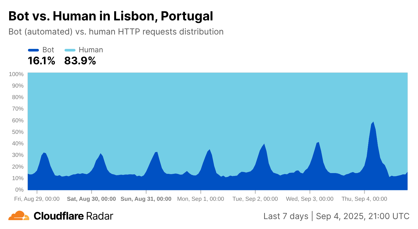
Similar to how the mobile vs. desktop view exposes shifts in human activity, bot vs. human traffic insights do as well. One interpretation of the graph below is that overnight bot activity from Lisbon increased significantly during the first few days of September. However, since the graph shows traffic shares, and given the timing of the apparent increases, the more likely cause is increasingly larger drops in human-driven traffic – users in Lisbon appear to begin logging off around 23:00 UTC (midnight local time), and start getting back online around 05:00 UTC (06:00 local time). The shares and shifts will obviously vary by country and region, but they can provide a perspective on the nocturnal habits of users in a region.

Customize regional analysis with Radar’s Data Explorer
Within the Data Explorer, you can use the breakdown options and filters to customize your analysis of regional traffic data.
At a country level, choosing to breakdown by regions generates a stacked area graph that shows the relative traffic shares of the top 20 regions in the selected country, along with a bar graph showing summary share values. For example, the graph below shows that in aggregate, Virginia and California are responsible for just over a quarter of the HTTP request volume in the United States.


You can also use Data Explorer to drill down on traffic at a network (ASN) level in a given region, in both summary and timeseries views. For example, looking at HTTP request traffic for Massachusetts by ASN, we can see that AS7922 (Comcast), accounts for a third, followed by AS701 (Verizon Fios, 15%), AS21928 (T-Mobile, 8.8%), AS6167 (Verizon Wireless, 5.1%), AS7018 (AT&T, 4.7%), and AS20115 (Charter/Spectrum, 4.5%). Over 70% of the request traffic is concentrated in these six providers, with nearly half of that from one provider.


Going a level deeper, you can also look at traffic trends over time for an ASN within a given region, and even compare it with another time period. The graph below shows traffic for AS7922 (Comcast) in Massachusetts over a seven-day period, compared with the prior week. While the traffic volumes on most days were largely in line with the previous week, Saturday and Sunday were noticeably higher. These differences may reflect a shift in human activity, as September 6 & 7 were quite rainy in Massachusetts, so people may have spent more time indoors and online. (The prior weekend was Labor Day weekend, but those Saturday and Sunday traffic levels were in line with the preceding weekend.) You can also add another ASN to the traffic trends comparison. Selecting Massachusetts (Location) and AS701 (ASN) (Verizon Fios) in the Compare section finds that traffic on that network was higher on Saturday and Sunday as well, lending credence to the rainy weekend theory.


Regional comparisons, whether within the same country or across different countries, are also possible in Data Explorer. For instance, if the Kansas City Chiefs and Philadelphia Eagles were to meet yet again in the Super Bowl, the configuration below could be used to compare traffic patterns in the teams’ respective home states, as well as comparing the trends with the previous week, showing how human activity impacted it over the course of the game.

As always, the data powering the visualizations described above are also available through the Radar API. The timeseries_groups and summary methods for the NetFlows and HTTP endpoints now have an ADM1 dimension, allowing traffic to be broken down by first-order administrative divisions. In addition, the new geoId filter for the NetFlows and HTTP endpoints allows you to filter the results by a specific geolocation, using its GeoNames ID. And finally, there are new get and list endpoints for fetching geolocation details.
A note regarding data quantity and quality
As you’d expect, the more traffic we see from a given geography, the better the “signal”, and the clearer the associated graph is — this is generally the case when traffic is aggregated at a country level. However, for some smaller or less populous regions, especially in developing countries or countries with poor Internet connectivity, lower traffic will likely cause the signal to be weaker, resulting in graphs that appear spiky or incomplete. (Note that this will also be true for region+ASN views.) An illustrative example is shown below, for Northern Darfur State in Sudan. Traffic is observed somewhat inconsistently, resulting in the spikes seen in the graph. Similarly, the “Previous 7 days” line is largely incomplete, indicating a lack of traffic data for that period. In these cases, it will be hard to draw definitive conclusions from such graphs.

Although the Internet arguably transcends geographical boundaries, the reality is that usage patterns can vary by location, with traffic trends that reflect more localized human activity. The new regional insights on Cloudflare Radar traffic pages, and in the Data Explorer, provide a perspective at a sub-national level. We are exploring the potential to go a level deeper in the future, providing traffic data for “second-order administrative divisions” (such as counties, cities, etc.).
If you share our regional traffic graphs on social media, be sure to tag us: @CloudflareRadar (X), noc.social/@cloudflareradar (Mastodon), and radar.cloudflare.com (Bluesky). If you have questions or comments, you can reach out to us on social media, or contact us via email.
Introducing Certificate Transparency insights on Radar
Just as we're bringing more granular detail to traffic patterns, we're also shedding more light on the very foundation of trust on the Internet: TLS certificates. Certificate Authorities (CAs) serve as trusted gatekeepers for the Internet: any website that wants to prove its identity to clients must present a certificate issued by a CA that the client trusts. But how do we know that CAs themselves are trustworthy and only issue certificates they are authorized to issue?
That’s where Certificate Transparency (CT) comes in. Clients that enforce CT (most major browsers) will only trust a website certificate if it is both signed by a trusted CA and has proof that the certificate has been added to a public, append-only CT log, so that it can be publicly audited. Only recently, CT played a key role in detecting the unauthorized issuance of certificates for 1.1.1.1, a public DNS resolver service that Cloudflare operates.
In addition to its role as a vital safety mechanism for the Internet, CT has proven to be invaluable in other ways, as it provides publicly-accessible lists of all website certificates used on the Internet. This dataset is a treasure trove of intelligence for researchers measuring the Internet, security teams detecting malicious activity like phishing campaigns, or penetration testers mapping a target’s external attack surface.
The sheer amount of data (multiple terabytes) available in CT makes it difficult for regular Internet users to download and explore themselves. Instead, services like crt.sh, Censys, and Merklemap provide easy search interfaces to allow discoverability for specific domain names and certificates. We launched Merkle Town in 2018 to share broad insights into the CT ecosystem using data from our own CT monitoring service.
Certificate Transparency on Cloudflare Radar is the next evolution of Merkle Town, providing integration with security and domain information already on Radar and more interactive ways to explore and analyze CT data. (For long-time Merkle Town users, we’re keeping it around until we’ve reached full feature parity.)
In the sections below, we’ll walk you through the features available in the new dashboard.
Certificate volume and characteristics
The CT page leads with a view of how many certificates are being issued and logged over time. Because the same certificate can appear multiple times within a single log or be submitted to several logs, the total count can be inflated. To address this, two distinct lines are shown: one for total entries and another for unique entries. Uniqueness, however, is calculated only within the selected time range — for example, if certificate C is added to log A in one period and to log B in another, it will appear in the unique count for both periods. It is also important to note that the CT charts and date filters use the log timestamp, which is the time a certificate was added to a CT log. Additionally, the data displayed on the page was collected from the logs monitored by Cloudflare — delays, backlogs, or other inconsistencies may exist, so please report any issues or discrepancies.
Alongside this chart is a comparison between certificates and pre-certificates. A pre-certificate is a special type of certificate used in CT that allows a CA to publicly log a certificate before it is officially issued. CAs are not required to log full certificates if corresponding pre-certificates have already been logged (although many CAs do anyway), so typically there are more pre-certificates logged than full certificates, as seen in the chart.

While certificate issuance trends are interesting on their own, analyzing the characteristics of issued certificates provides deeper insight into the state of the web’s trust infrastructure. Starting with the public key algorithm, which defines how secure connections are established between clients and servers, we found that more than 65% of certificates still use RSA, while the remainder use ECDSA. RSA remains dominant due to its long-standing compatibility with a wide range of clients, while ECDSA is increasingly adopted for its efficiency and smaller key sizes, which can improve performance and reduce computational overhead. In the coming years, we expect post-quantum signature algorithms like ML-DSA to appear when public CAs begin to offer support.
Next, a breakdown of certificates by signature algorithm reveals how Certificate Authorities (CAs) sign the certificates they issue. Most certificates (over 65%) use RSA with SHA-256, followed by ECDSA with SHA-384 at 19%, ECDSA with SHA-256 at 12%, and a small fraction using other algorithms. The choice of signature algorithm reflects a balance between widespread support, security, and performance, with stronger algorithms like ECDSA gradually gaining traction for modern deployments.
Certificates are also categorized by validation level, which reflects the degree to which the CA has verified the identity of the certificate requester. The main validation types are Domain Validation (DV), Organization Validation (OV), and Extended Validation (EV). DV certificates verify only control of the domain, OV certificates verify both domain control and the organization behind it, and EV certificates involve more rigorous checks and display additional identity information in browsers. The industry trend is toward simpler, automated issuance, with DV certificates now making up almost 98% of issued certificates, while EV issuance has become largely obsolete.

Finally, the chart on certificate duration shows the difference between the NotBefore and NotAfter dates embedded in each certificate, which define the period during which the certificate is valid. Currently, the majority (92%) of issued certificates have durations between 47 and 100 days. Shorter certificate lifetimes improve security by limiting exposure if a certificate is compromised, and the industry is moving toward even shorter durations, driven by browser policies and automated renewal systems.

Certificate issuance
Certificate issuance is the process by which CAs generate certificates for domain owners. Many CAs are operated by larger organizations that manage multiple subordinate CAs under a single corporate umbrella. The CT page highlights the distribution of certificate issuance across the top CA owners. At the moment, the Internet Security Research Group (ISRG), also known as Let’s Encrypt, issues more than 66% of all certificates, followed by other widely used CA owners including Google Trust Services, Sectigo, and GoDaddy.

The impact of events like the July 21-22 Let’s Encrypt API outage due to internal DNS failures that significantly reduced certificate issuance rates are visible in this visualization, as issuance rates dropped significantly during the two-day period.

In addition to CA owners, the page provides a breakdown of certificate issuance by individual CA certificates. Among the top five CAs, Let’s Encrypt’s four intermediate CAs — R12, R13, E7, and E8 — represent the bulk of its issuance. The bar chart can also be filtered by CA owner to display only the certificates associated with a specified organization.

The CT section also offers dedicated CA-specific pages. By searching for a CA name or fingerprint in the top search bar, you can reach a page showing all insights and trends available on the main CT page, filtered by the selected CA. The page also includes an additional CA information card, which provides details such as the CA’s owner, revocation status, parent certificate, validity period, country, inclusion in public root stores, and a list of all CAs operated by the same owner. All of this information is derived from the Common CA Database (CCADB).

Certificate Transparency logs
Next on the CT page is a section focused on CT logs. This section shows the distribution of certificates across CT log operators, identifying the organizations that manage the infrastructure behind the logs. Over the last three months, Sectigo operated the logs containing the largest number of certificates (2.8 billion), followed by Google (2.5 billion), Cloudflare (1.6 billion), and Let’s Encrypt (1.4 billion). Note that the same certificate can be logged multiple times across CT logs, so organizations that operate multiple CT logs with overlapping acceptance criteria may log certificates at an elevated rate. As such, the relative rank of the operators in this graph should not be construed as a measure of how load-bearing the logs are within the ecosystem.

Below this, a bar chart displays the distribution of certificates across individual CT logs. Among the top five logs are Google’s xenon2025h1 and argon2025h2, Cloudflare’s nimbus2025, and Let’s Encrypt’s oak2025h2. This chart can also be filtered by operator to show only the logs associated with a specific owner. Next to the chart, another view shows the distribution of certificates by log API, distinguishing between logs following the original RFC 6962 API versus those compatible with the newer and more efficient static CT API.

Similar to the dedicated CA pages, the CT section also provides log-specific pages. By searching for a log name in the top search bar, you can access a page showing all insights and trends available on the main CT page, filtered by the selected log. Two additional cards are included: one showing information about the log, derived from Google Chrome’s log list, including details such as the operator, API type, documentation, and a list of other logs operated by the same organization; and another displaying performance metrics with two radar charts tracking uptime and response time over the past 90 days, as observed by Cloudflare’s CT monitor. These metrics are useful to determine if logs are meeting the ongoing requirements for inclusion in CT programs like Google's.

Certificate coverage
Last but not least, the CT page includes a section on certificate coverage. Certificates can cover multiple top-level domains (TLDs), include wildcard entries, and support IP addresses in Subject Alternative Names (SANs).
The distribution of pre-certificates across the top 10 TLDs highlights the domains most commonly covered. .com leads with 45% of certificates, followed by other popular TLDs such as .dev and .net.
Next to this view, two half-donut charts provide further insights into certificate coverage: one shows the share of certificates that include wildcard entries — almost 25% of certificates use wildcards to cover multiple subdomains — while the other shows certificates that include IP addresses, revealing that the vast majority of certificates do not contain IPs in their SAN fields

Expanded domain certificate data
The domain information page has also been updated to provide richer details about certificates. The certificates table, which displays certificates recorded in active CT logs for the specified domain, now includes expandable rows. Expanding a row reveals further information, including the certificate’s SHA-256 fingerprint, subject and issuer details — Common Name (CN), Organization (O), and Country (C) — the validity period (NotBefore and NotAfter), and the CT log where the certificate was found.

While the charts above highlight key insights in the CT ecosystem, all underlying data is accessible via the API and can be explored interactively across time periods, CAs, logs, and additional filters and dimensions using Radar’s Data Explorer. And as always, Radar charts and graphs can be downloaded for sharing or embedded directly into blogs, websites, and dashboards for further analysis. Don’t hesitate to reach out to us with feedback, suggestions, and feature requests — we’re already working through a list of early feedback from the CT community!
Cloudflare's connectivity cloud protects entire corporate networks, helps customers build Internet-scale applications efficiently, accelerates any website or Internet application, wards off DDoS attacks, keeps hackers at bay, and can help you on your journey to Zero Trust.
Visit 1.1.1.1 from any device to get started with our free app that makes your Internet faster and safer.
To learn more about our mission to help build a better Internet, start here. If you're looking for a new career direction, check out our open positions.