2025-09-26
15 min read

Modern users expect instant, reliable web experiences. When your application is slow, they don’t just complain — they leave. Even delays as small as 100 ms have been shown to have a measurable impact on revenue, conversions, bounce rate, engagement and more.
If you’re responsible for delivering on these expectations to the users of your product, you know there are many monitoring tools that show you how visitors experience your website, and can let you know when things are slow or causing issues. This is essential, but we believe understanding the condition is only half the story. The real value comes from integrating monitoring and remedies in the same view, giving customers the ability to quickly identify and resolve issues.
That's why today, we're excited to launch the new and improved Observatory, now in open beta. This monitoring and observability tool goes beyond charts and graphs, by also telling you exactly how to improve your application's performance and resilience, and immediately showing you the impact of those changes. And we’re releasing it to all subscription tiers (including Free!), available today.

But wait, there’s more! To make your users’ experience in Cloudflare even faster, we’re launching Smart Shield, available today for all subscription tiers. Using Observatory, you can pinpoint performance bottlenecks, and for many of the most common issues, you can now apply the fix in just a few clicks with our Smart Shield product. Double the fun!
Our unique perspective: leveraging data from 20% of the web
Every day, Cloudflare handles traffic for over 20% of the web, giving us a unique vantage point into what makes websites faster and more resilient. We built Observatory to take advantage of this position, uniting data that is normally scattered across different tools — including real-user data, synthetic testing, error rates, and backend telemetry — into a single platform. This gives you a complete, cohesive picture of your application's health end-to-end, in one spot, and enables you to easily identify and resolve performance issues.
For this launch, we're bringing together:
Real-user data: See how your application performs for real people, in the real world.
Back-end telemetry: Break down the lifecycle of a request to pinpoint areas for improvement.
Error rates: Understand the stability of your application at both the edge and origin.
Cache hit ratios: Ensure you're maximizing the performance of your configuration.
Synthetic testing: Proactively test and monitor key endpoints with powerful, accurate simulations.
Let's take a quick look at each data set to see how we use them in Observatory.
Real-user data
There are two primary forms of data collection: real-user data and synthetic data. Real-user data are performance metrics collected from real traffic, from real visitors, to your application. It’s how users are actually seeing your application perform in the real world. It’s unpredictable, and covers every scenario.
Synthetic data is data collected using some sort of simulated test (loading a site in a headless browser, making network requests from a testing system to an endpoint, etc.). Tests are run under a predefined set of characteristics — location, network speed, etc. — to provide a consistent baseline.
Both forms of data have their uses, and companies with a strongly established culture of operational excellence tend to use both.
The first data you’ll see when you visit Observatory is real-user data collected with Real User Monitoring (RUM), with a particular focus on the Core Web Vital metrics.

This is very intentional.
Real-user data should be the source of truth when it comes to measuring performance and resiliency of your application. Even the best of synthetic data sources are always going to be an approximation. They cannot cover every possible scenario, and because they are being run from a lab environment, they will not always reveal issues that may be more sporadic and unpredictable.
They’re also the best representation of what your users are experiencing when they access your site and, at the end of the day, that’s why we focus on improving performance, resiliency, and security for our users.
We believe so strongly in the importance of every company having access to accurate, detailed RUM data that we are providing it for free, to all accounts. In fact, we’re about to make our privacy-first analytics — which doesn’t track individual users for analytics — available by default for all free zones (excluding data from EU or UK visitors), no setup necessary. We believe the right thing is arming everyone with detailed, actionable, real-user data, and we want to make it easy.
Backend telemetry
Front-end performance metrics are our best proxy for understanding the actual user experience of an application and as a result, they work great as key performance indicators (KPI’s).
But they’re not enough. Every primary metric should have some level of supporting diagnostic metrics that help us understand why our user metrics are performing like they are — so that we can quickly identify issues, bottlenecks, and areas of improvement.

While the industry has largely, and rightfully, moved on from Time to First Byte (TTFB) as a primary metric of focus, it still has value as a diagnostic metric. In fact, we analyzed our RUM data and found a very strong connection between Time to First Byte and Largest Contentful Paint.
Google’s recommended thresholds for Time to First Byte are:
Good: <= 800ms
Needs Improvement: > 800ms and <= 1800ms
Poor: > 1800ms
Similarly, their official thresholds for Largest Contentful Paint are:
Good: <= 2500ms
Needs Improvement > 2500ms and <= 4000ms
Poor: > 4000ms
Looking across over 9 billion events, we found that when compared to the average site, sites with a “poor” (>1800ms) TTFB are:
70.1 percentage points less likely to have a “good” LCP
21.9 percentage points more likely to have a “needs improvement” LCP
48.2 percentage points more likely to have a “poor” LCP
TTFB is an ill-defined blackbox, so we’re making a point to break that down into its various subparts so you can quickly pinpoint if the issue is with the connection establishment, the server response time, the network itself, and more. We’ll be working to break this down even further in the coming months as we expose the complete lifecycle of a request so you’re able to pinpoint exactly where the bottlenecks lie.
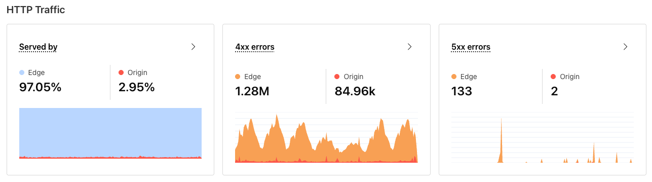
Errors & cache ratios
Degradation in stability and performance are frequently directly connected to configuration changes or an increase in errors. Clear visibility into these characteristics can often cut right to the heart of the issue at hand, as well as point to opportunities for improvement of the overall efficiency and effectiveness of your application.

Observatory prominently surfaces cache hit ratio and error rates for both the edge and origin. This compliments the backend telemetry nicely, and helps to further breakdown the backend metrics you are seeing to help pinpoint areas of improvement.
Take cache hit ratio for example. Intuitively, we know that when content is served from cache on an edge server, it should be faster than when the request has to go all the way back to the origin server. Based on our data, again, that’s exactly what we see.
If we consider our Time To First Byte thresholds again (good is <= 800ms; needs improvement is > 800ms and less than 1800ms; poor is anything over 1800ms), when looking across 9 billion data points as collected by our RUM solution, we see that a whopping 91.7% of all pages served from Cloudflare’s cache have a “good” TTFB compared to 79.7% when the request has to be served from the origin server.
In other words, optimizing origin performance (more on that in a bit) and moving more content to the edge are sure-fire ways to give you a much stronger performance baseline.
Accurate and detailed synthetic testing
While real-user data is our source of truth, synthetic testing and monitoring is important as well. Because tests are run in a more controlled environment (test from this location, at this time, with this criteria, etc.), the resulting data is a lot less noisy and variable. In addition, because there is not a user involved and we don’t have to worry about any observer effect, synthetic tests are able to grab a lot more information about the request and page lifecycle.
As a result, synthetic data tends to work very well for arming engineers with debugging information, as well as providing a cleaner set of data for comparing and contrasting results across different platforms, releases, and other situations.
Observatory provides two different types of synthetic tests.
The first synthetic test is a browser test. A browser test will load the requested page in a headless browser, run Google’s Lighthouse on it to report on key performance metrics, and provide some light suggestions for improvement.

The second type of synthetic test Observatory provides is a network test. This is a brand new test type in Cloudflare, and is focused on giving you a better breakdown of the network and back-end performance of an endpoint.
Each network test will hit the provided endpoint for the test and record the wait time, server response time, connect time, SSL negotiation time, and total load time for the endpoint response. Because these tests are much more targeted, a single test in itself is not as valuable and can be prone to variation. That variation isn’t necessarily a bad thing—in fact, variability in these results can actually give you a better understanding of the breadth of results when real users hit that same endpoint.
For that reason, network tests trigger a series of individual runs against the provided endpoint spread out over a short period of time. The data for each response is recorded, and then presented as a histogram on the test results page, letting you see not just a single datapoint, but the long and short-tail of each metric. This gives you a much more accurate representation of reality than what a single test run can provide.

You are also able to compare network tests in Observatory, by selecting two network tests that have been completed. Again, all the data points for each test will be provided in a histogram, where you can easily compare the results of the two.

We are working on improving both synthetic test types in Q4 2025, focusing on making them more powerful and diagnostic.
As we mentioned before, even at its best, synthetic data is an approximation of what is actually happening. Accuracy is critical. Inaccurate data can distract teams with variability and faulty measurements.
It’s important that these tools are as accurate and true to the real world as possible. It’s also important to us that we give back to the community, both because it’s the right thing to do, and because we believe the best way to have the highest level of confidence in the measurement tools and frameworks we’re using is the rigor and scrutiny that open-source provides.
For those reasons, we’ll be working on open-sourcing many of the testing agents we’re using to power Observatory. We’ll share more on that soon, as well as more details about how we’ve built each different testing tool, and why.
Doing something about it: Smart Suggestions
People don’t measure for the sake of having data and pretty charts. They measure because they want to be able to stay on top of the health of their application and find ways to improve it. Data is easy. Understanding what to do about the data you’re presented is both the hardest, and most important, part.
Monitoring without action is useless.
We’re building Observatory to have a relentless focus on actionability. Before any new metric is presented, we take some time to explore why that metric matters, when it’s something worth addressing, and what actions you should take if those metrics need improvement.
All of that leads us to our new Smart Suggestions. Wherever possible, we want to pair each metric with a set of opinionated, data-driven suggestions for how to make things better. We want to avoid vague hand-wavy advice and instead be prescriptive and specific and precise.
For example, let’s look at one particular recommendation we provide around improving Largest Contentful Paint.
Largest Contentful Paint is a core web vital metric that measures when the largest piece of content is displayed on the screen. That piece of content could be an image, video or text.
Much like TTFB, Largest Contentful Paint is a bit of a black box by itself. While it tells us how long it takes for that content to get on screen, there are a large number of potential bottlenecks that could be causing the delay. Perhaps the server response time was very slow. Or maybe there was something blocking the content from being displayed on the page. If the object was an image or video, perhaps the filesize was large and the resulting download was slow. LCP by itself doesn’t give us that level of granularity, so it’s hard to give more than hand wavy guidance on how to address it.
Thankfully, just like we can break TTFB into subparts, we can break LCP into its subparts as well. Specifically we can look at:
Time to First Byte: how quickly the server responds to the request for HTML
Resource Load Delay: How long it takes after TTFB for the browser to discover the LCP resource
Resource Load Duration: How long it takes for the browser to download the LCP resource
Render Delay: How long it takes the browser to render the content, after it has the resource in hand.
Breaking it down into these subparts, we can be much more diagnostic about what to do.

In the example above, our recommendation engine analyzes the site's real-user data and notices that Resource Load Delay accounts for over 10% of total LCP time. As a result, there’s a high likelihood that the resource triggering LCP is large and could potentially be compressed to reduce file size. So we make a recommendation to enable compression using Polish.
We’re very excited about the impact these suggestions will have on helping everyone quickly zero in on meaningful solutions for improving performance and resiliency, without having to wade through mountains of data to get there. As we analyze data, we’ll find more and more patterns of problems and the solutions they can map to. Expanding on our Smart Suggestions will be a constant and ongoing focus as we move forward, and we are working on adding much more content about those patterns and what we find in Q4.
Fixing the biggest pain point: Smart Shield
Observatory gives you unprecedented insight into your application's health, but insights are only half the battle. The next challenge is acting on them, which brings us to another layer of complexity: protecting your origin. For many of our customers, proper management of origin routes and connections is one of the largest drivers of aggregate overall performance. As we mentioned before, we see a clear negative impact on user-facing performance metrics when we have to go back to the origin, and we want to make it as easy as possible for our customers to improve those experiences. Achieving this requires protecting against unnecessary load while ensuring only trusted traffic reaches your servers.
Today's customers have powerful tools to protect their origins, but achieving basic use cases remains frustratingly complex:
Making applications faster
Reducing origin load
Understanding origin health issues
Restricting IP address access to origin servers
These fundamental needs currently require navigating multiple APIs and dashboard settings. You shouldn't need to become an expert in each feature — we should analyze your traffic patterns and provide clear, actionable solutions.
Smart Shield: the future of origin shielding
Smart Shield transforms origin protection from a complex, multi-tool challenge into a streamlined, intelligent solution that works on your behalf. Our unified API and UI combines all origin protection essentials — dynamic traffic acceleration, intelligent caching, health monitoring, and dedicated egress IPs — into one place that enables single-click configuration.
But we didn't stop at simplification. Smart Shield integrates with Observatory to provide both the “what” — identifying performance bottlenecks and health issues — and the “how” — delivering capabilities that increase performance, availability, and security.
This creates a continuous feedback loop: Observatory identifies problems, Smart Shield provides solutions, and real-time analytics verify the impact.


But what does this mean for you?
Reduce total cost of ownership (TCO)
Reduce the time-to-value (TTV) for performance, availability, and security issues pertaining to customer origins
Enable new features without guesswork and validate effectiveness in the data
Your time stays focused on building incredible user experiences, not becoming a configuration expert. We are excited to give you back time for your customers and your engineers, while paving the way for how you make sure your origin infrastructure is easily optimized to delight your customers.
Protecting and accelerating origins with smart Connection Reuse
Keeping your origins fast and stable is a big part of what we do at Cloudflare. When you experience a traffic surge, the last thing you want is for a flood of TLS handshakes to knock your origin down, or for those new connections to stall your requests, leaving your users to wait for slow pages to load.
This is why we’ve made significant changes to how Cloudflare’s network talks to your origins to dramatically improve the performance of our origin connections.
When Cloudflare makes a request to your origins, we make them from a subset of the available machines in every Cloudflare data center so that we can improve your connection reuse. Until now, this pool would be sized the same by default for every application within a data center, and changes to the sizing of the pool for a particular customer would need to be made manually. This often led to suboptimal connection reuse for our customers, as we might be making requests from way more machines than were actually needed, resulting in fewer warm connection pools than we otherwise could have had. This also caused issues at our data centers from time to time, as larger applications might have more traffic than the default pool size was capable of serving, resulting in production incidents where engineers are paged and had to manually increase the fanout factor for specific customers.
Now, these pool sizes are determined automatically and dynamically. By tracking domain-level traffic volume within a datacenter, we can automatically scale up and scale down the number of machines that serve traffic destined for customer origin servers for any particular customer, improving both the performance of customer websites and the reliability of our network. A massive, high-volume website with a considerable amount of API traffic will no longer be processed by the same number of machines as a smaller and more typical website. Our systems can respond to changes in customer traffic patterns within seconds, allowing us to quickly ramp up and respond to surges in origin traffic.
Thanks to these improvements, Cloudflare now uses over 30% fewer connections across the board to talk to origins. To put this into a more understandable perspective, this translates to saving approximately 402 years of handshake time every day across our global traffic, or 12,060 years of handshake time saved per month! This means just by proxying your traffic through Cloudflare, you’ll see a 30% on average reduction in the amount of connections to your origin, keeping it more available while serving the same traffic volume and in turn lowering your egress fees. But, in many cases, the results observed can be far greater than 30%. For example, in one data center which is particularly heavy in API traffic, we saw a reduction in origin connections of ~60%!
Many don’t realize that making more connections to an origin requires more compute and time for systems to create TCP and SSL handshakes. This takes time away from serving content requested by your end-users and can act as a hidden tax on your performance and overall to your application. We are proud to reduce the Internet's hidden tax by finding intelligent, innovative ways to reduce the amount of connections needed while supporting the same traffic volume.
Watch out for more updates to Smart Shield at the start of 2026 — we’re working on adding self-serve support for dedicated CDN egress IP addresses, along with significant performance, reliability, and resilience improvements!
Charting the course: next steps for Observatory & Smart Shield
We’re really excited to share these two products with everyone today. Smart Shield and Observatory combine to provide a powerful one-two punch of insight and easy remediation.
As we navigate the beta launch of Observatory, we know this is just the start.
Our vision for Observatory is to be the single source of truth for your application’s health. We know that making the right decisions requires robust, accurate data, and we want to arm our customers with the most comprehensive picture available.
In the coming months, we plan to continue driving forward with our goal of providing comprehensive data, backed by a clear path to action.
Deeper, more diagnostic data. We’ll continue to break down data silos, bringing in more metrics to make sure you have a truly comprehensive view of your application’s health. We’ll be focused on going deeper and being more diagnostic, breaking down every aspect of both the request and page lifecycle to give you more granular data.
More paths to solutions. People don’t measure for the sake of looking at data, they measure to solve problems. We’re going to continue to expand our suggestions, arming you with more precise, data-driven solutions to a wider range of issues, letting you fix problems with a single click through Smart Shield and bringing a tighter feedback loop to validate the impact of your configuration updates.
Benchmarking against other products. Some of our customers split traffic between different CDNs due to regulatory or compliance requirements. Naturally, this brings up a whole series of questions about comparing the performance of the split traffic. In Observatory, you can compare these today, but we have a lot of things planned to make this even easier.
Try out Observatory and Smart Shield yourself today. And if you have ideas or suggestions for making Observatory and Smart Shield better, we’re all ears and would love to talk!
Cloudflare's connectivity cloud protects entire corporate networks, helps customers build Internet-scale applications efficiently, accelerates any website or Internet application, wards off DDoS attacks, keeps hackers at bay, and can help you on your journey to Zero Trust.
Visit 1.1.1.1 from any device to get started with our free app that makes your Internet faster and safer.
To learn more about our mission to help build a better Internet, start here. If you're looking for a new career direction, check out our open positions.