2024-9-21 04:26:4 Author: hackernoon.com(查看原文) 阅读量:1 收藏
Hey there, data enthusiasts and tech-savvy strategists! Ever wondered how to quantify the often subjective world of KPI prioritization? Grab your favorite caffeinated beverage because we're about to embark on a journey into the nitty-gritty of a KPI prioritization tool that's changing the game, all while exploring the crucial 5 W's of effective KPIs.

The Problem: Subjectivity in KPI Selection
Let's face it: choosing which KPIs to focus on can feel like trying to pick your favorite child. It's subjective, emotionally charged, and often leads to heated debates in boardrooms. But what if we could bring some cold, hard data into the mix?
For weeks, I've been pondering how to improve communication in the KPI selection process, make it transparent to all sides, and create a common reality for everyone involved. This reflection was sparked by the recurring challenges I've observed in implementing successful data strategies, which I also discussed in my previous HackerNoon article, "Why Data Strategies Fail in Companies – And How CEOs Can Fix Them."
The Origin of a Solution
This tool is the result of months of reflection on how to bridge the communication gap between data teams and business stakeholders. It's designed to create transparency, align priorities, and establish a shared understanding of the challenges and opportunities in data strategy implementation.
The tool is version 1.0, and now, we are waiting for your feedback to get iterated.
The Solution: A Tech-Driven Approach to KPI Prioritization
Enter my KPI prioritization tool. It's not just another spreadsheet – it's a carefully crafted algorithm that balances monetary value with strategic relevance, all while considering implementation complexity. Let's break it down using the 5 W's framework:
Why: Understanding the Purpose of Your KPIs
The 'Why' is the foundation of any effective KPI. My tool helps you articulate this by considering:
-
Monthly Monetary Value: How much cash does this KPI represent each month, either by saving money or earning money?
-
Strategic Relevance Factors:
-
Long-Term Vision
-
Short-Term Objectives
-
Company Values
-
These factors help you create a clear KPI Purpose Statement: "We measure [KPI] because it tells us [insight], to achieve [business objective]."
In the 5 W’s of effective KPIs, I am covering also the WHAT, Where, When and Who, however, this tool is meant to help more with the WHY definition. If you are interested in learning more about the other 4 W’s, I will invite you to check my article about the framework, and if you wish to get my new book release update about the framework, subscribe to my substack.
Without dealing it any longer, let me explain a bit more about the tool, and how to use it
The Solution: A Tech-Driven Approach to KPI Prioritization
Enter my KPI prioritization tool. It's not just another spreadsheet – it's a carefully crafted algorithm that balances monetary value with strategic relevance. Let's break it down, shall we?
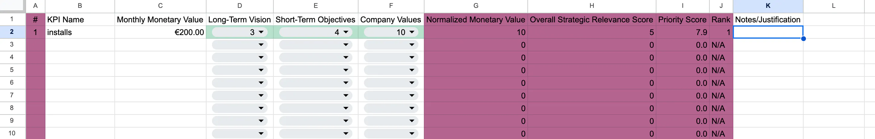
Part 1: Prioritization Calculation
This spreadsheet is where the magic begins. Let's decode what's happening:
-
Monthly Monetary Value (Column C): This is straightforward – how much moolah does this KPI represent each month? What we wish to evaluate here is the money that can be saved or the money that will be made using this data, for example, if you have an ML model that generates recommendations for upsells, you know that fresh data in the model can increase your revenue line with $10,000 a month; this is what you need to use.
-
Normalized Monetary Value (Column G): Here's where it gets interesting. We use a logarithmic scale to normalize the monetary values. Why? Because in the real world, the difference between a $1M and $2M impact is often more significant than between $10M and $11M.
Normalized Value = LOG(Monthly Monetary Value) / LOG(max(Monthly Monetary Value)) -
Strategic Relevance Factors:
-
Long-Term Vision (Column D)
-
Short-Term Objectives (Column E)
-
Company Values (Column F)
Each rated on a scale of 1-10. But why these three? They represent the past, present, and future of your company's strategy. Balancing act, anyone?
-
-
This ensures that smaller, but still significant, monetary impacts aren't completely overshadowed by the big hitters.
-
Overall Strategic Relevance Score (Column H):
(0.4 * Long-Term Vision) + (0.4 * Short-Term Objectives) + (0.2 * Company Values)Notice the weights? We're saying that long-term and short-term objectives are equally important (0.4 each), while company values act as a "tie-breaker" (0.2). You can change the values if you wish to in columns Q

-
Priority Score (Column I):
(0.6 * Normalized Monetary Value) + (0.4 * Overall Strategic Relevance Score)This final calculation gives slightly more weight to the monetary aspect (0.6) than the strategic relevance (0.4). Why? Because at the end of the day, we're running a business, not a philosophy club.
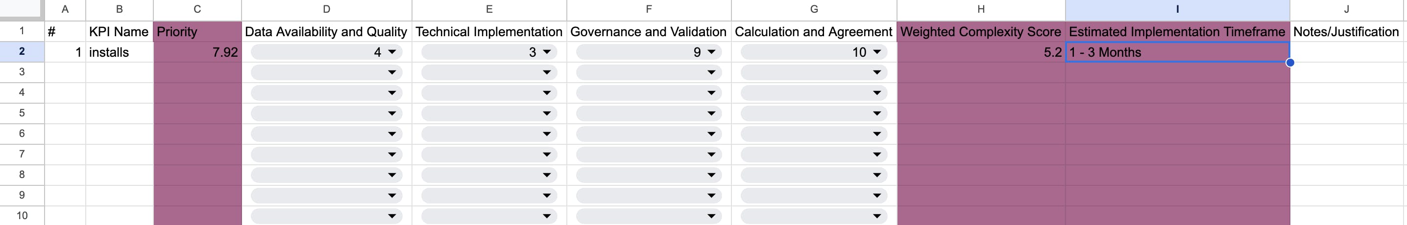
Part 2: Complexity Assessment

Now that we've prioritized our KPIs, we need to understand how hard they'll be to implement. Enter the complexity assessment:
-
Four Dimensions of Complexity:
- Data Availability and Quality
- Technical Implementation
- Governance and Validation
- Calculation and Agreement
Each rated from 1-10. Why these four? They cover the main pain points in implementing any data-driven initiative.
-
Weighted Complexity Score:
(0.3 * Data) + (0.3 * Technical) + (0.2 * Governance) + (0.2 * Calculation)Data and Technical aspects get a bit more weight because they often represent the biggest hurdles in implementation.
And here again, you can adjust the weights based on your need in the column Q

-
Estimated Implementation Timeframe: This is automatically calculated based on the Weighted Complexity Score. It's a quick way to gauge if you're looking at a quick win or a long-term project.
Part 3: The Final Overview
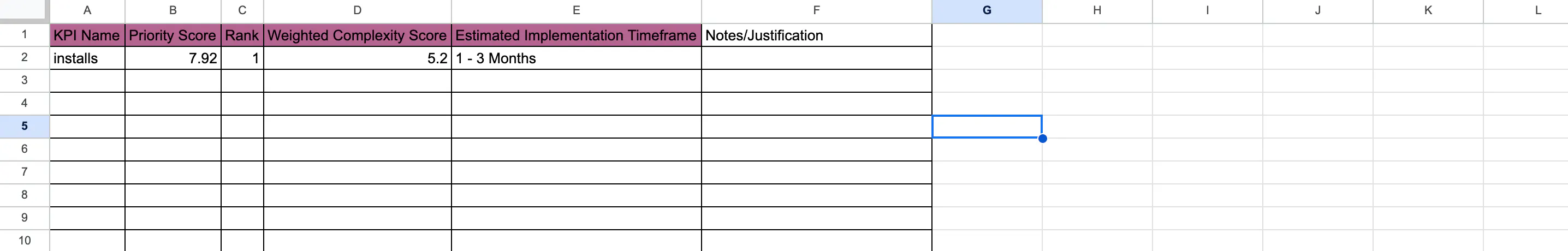
This is where it all comes together. We see our KPIs ranked by priority, with their complexity scores and estimated implementation times. It's like a battle plan for your data strategy.

The Tech Behind the Scenes
While the front end is a user-friendly spreadsheet, there's some serious number-crunching happening behind the scenes:
-
Logarithmic Normalization: This isn't just about making numbers look pretty. It's about creating a fair playing field for KPIs with vastly different monetary impacts.
-
Weighted Averages: By assigning different weights to various factors, we're essentially creating a customized algorithm that reflects the unique priorities of the business.
-
Automated Time Estimation: The tool uses the complexity score to estimate implementation time, saving you from guesstimating project timelines.
Why This Approach Rocks
-
Objectivity in Subjectivity: By quantifying strategic relevance, we're bringing objectivity to what's often a subjective process.
-
Scalability: Whether you're dealing with 5 KPIs or 500, this approach scales.
-
Transparency: The calculations are all there in the open. No black-box algorithms here!
-
Flexibility: Don't agree with the weights? Change 'em! The tool is designed to be customized to your organization's unique needs.
Connecting to the 5 W's of Effective KPIs
This KPI prioritization tool is deeply connected to the 5 W's framework of effective KPIs:
-
Why: The strategic relevance factors (Long-Term Vision, Short-Term Objectives, Company Values) help answer why each KPI is important.
-
What: The Monthly Monetary Value quantifies what impact each KPI can have on the business.
-
Where: The complexity assessment helps identify where in the organization the KPI implementation will have the most impact and face challenges.
-
When: The Estimated Implementation Timeframe gives a clear indication of when we can expect to see results from each KPI.
-
Who: While not explicitly part of the tool, the transparency it provides facilitates clear ownership and responsibility assignment.
By aligning with this framework, the tool ensures that each prioritized KPI is not just a metric, but a strategic lever for business improvement.

Wrapping Up
This tool isn't just about prioritizing KPIs – it's about bringing a tech-driven, data-focused approach to strategic decision-making. It's about speaking the language of both business and tech, bridging the gap between executives and data teams.
So, fellow data nerds, what do you think? Have you used similar approaches in your organizations? Any tweaks you'd suggest to the algorithm? Let's geek out in the comments!
And hey, if you want to take this tool for a spin in your organization, give me a shout. I'm always up for a good data strategy workshop (for a small fee, of course – a data scientist's gotta eat!).
You can download the KPI Prioritization Tool here.
Until next time, may your data be clean and your insights be plentiful!
如有侵权请联系:admin#unsafe.sh