2023-11-10 23:58:19 Author: blogs.sap.com(查看原文) 阅读量:7 收藏
The Journey
I’ve been using SAP Analytics Cloud for almost 8 years and like many of you, have stuck to stories rather than Analytic Applications as I don’t have a massive coding background. Well if truth be told, I’m old and so my Basic and Pascal skills haven’t had an airing for quite a few years.
With the latest innovations such as the Optimised Design Experience and the ability to add script elements to existing stories, I have now started to ‘enhance’ my visual storytelling. It struck me that rather than go big bang I would take an existing SAC Story and add code where I could get some quick wins without having to write big chunks of code.
Where to start this journey – that was the question and this blog series shows some small code elements that help me to create a more appealing, usable story that can add a little more finesse to the usability experience.
1. Show and Hide Stuff
So one of the elements i always want in a SAC story is the simple ability to Show one element and Hide another – just to swap one display type for another in the same real-estate. With the new Optimised Story type you can do exactly that, quickly and simply.
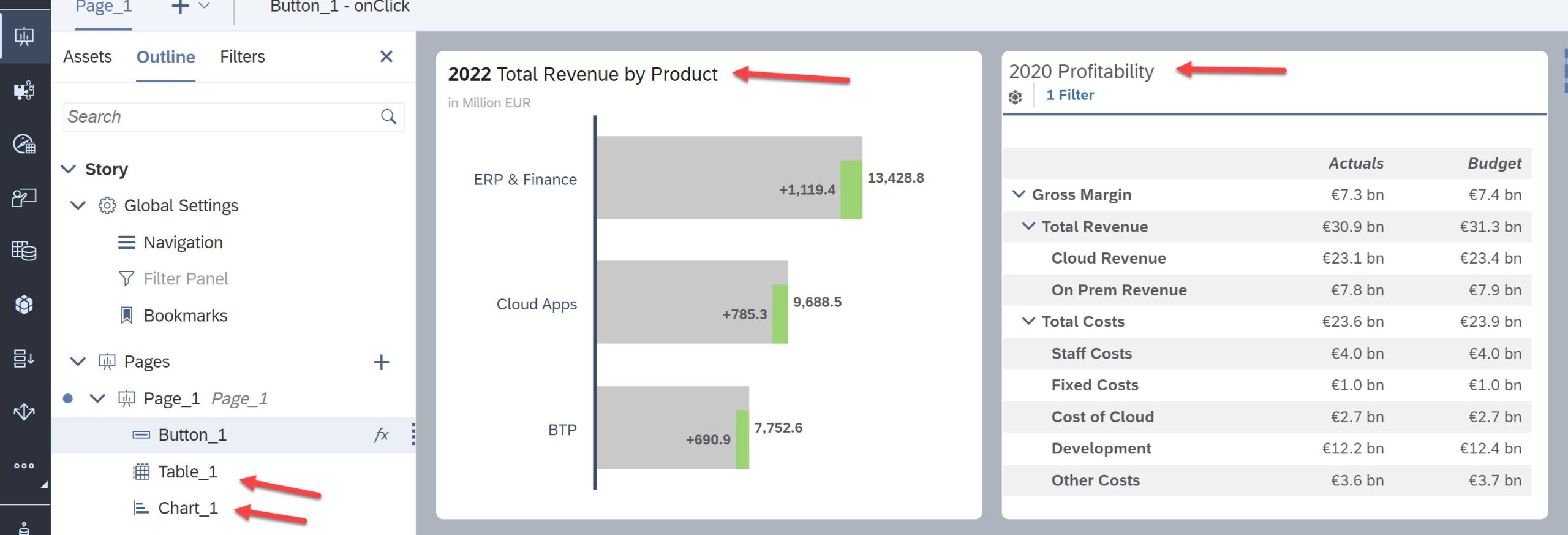
One difference of the Optimised Story is that each element you add to the page gets a default name and if you look in the Story Outline you’ll see all the objects you’ve added to your story.

Here we can see a simple story with 1 page added (Page_1) and two objects, (Chart_1) and (Table_1). You can see from the image we’ve got a simple bar chart and a table that have the names that SAC assigns as default. Currently they take up real-estate on the page that perhaps, could be used better. Maybe I want to allow the user to visibly switch between the chart or the table, but not both.
Simple ask and simple code so let’s see what we need to do to toggle between one and the other. We’re going to use a button control to switch between the two items – the logic (not the actual code) will be…
// This is not code, just the logic the code will follow:

    IF Chart is visible,
            Hide Chart &
            Show Table
    Otherwise
            Show Chart &
            Hide Table
    The End
In practice I’m going to add a Button and add the code to the onClick() button script. Access to the button scripts is via the Outline or right-mouse clicking the button and selecting the onClick script.

Add the following code:
// 	console.log("Check what's visible and switch");

if (Chart_1.isVisible())
{
	Chart_1.setVisible(false);
	Table_1.setVisible(true);
}
else {
	Chart_1.setVisible(true);
	Table_1.setVisible(false);
}
1st line is a comment – SAC uses the “//” notation to indicate the following line is for commentary only. We then have the IF condition to check if Chart_1 is visible? If it is hidden we show it and hide the table. If is is not visible the reverse is set, so each push of the button will then toggle what is displayed. Close, Save and View the story and you’ll now see a button that toggles the visible elements of the story between the chart and the table.
Simple ask, Simple code, Simple solution…
2. Add Columns / Rows to SAC Table
My second useful tip shows functionality that I want in all my stories. It allows a user to Add, Change or Remove measures and dimensions from an existing table at runtime. The benefits mean that I don’t have to grant Edit permission to a story but still allow users to change the table and save a bookmark to the new structure. I still want users to interact with the story wherever possible but don’t need to entire user community to have edit capabilities.
So let’s start with a New Button on the same story as the above example, we can name this button “Edit Table” and open the onClick() script and add the following code:
// Use openNavigationPanel to allow the user to add dimensions at runtime

Table_1.openNavigationPanel({expanded:true});
That’s all, just one line of code making sure the “Table_1” object is the same as the name of the table in your story. Save, Close and View the story and we now have a button that, when pushed gives you Available Objects panel for the selected table.

———————————
The OpenNavigationPanel() function tells the application to open the panel next to the table and the argument “expanded:true” means that both panels are open. If you change that to “expanded:false” open the right hand panel will open. The following video shows both behaviors:
Again a simple ask, simple code so a simple solution – we don’t need much code to get the desired functionality, here it’s just the one line.
As a side item I tend to use the Button object to attach my scripts, but I don’t tend to label the buttons. Instead I use an icon image on the button and a tooltip to explain the usage of the button action. Also the choice of icons is always the same, i don’t chop and change – each time a colleague sees a story they should know that this button does a specific task – always.
So choose your icons carefully, select the properties for the button, clear/remove the Text property and add instead add text to the Tooltip:
So a simple start to this series, we’ve learnt that you can control the visibility of objects with a couple of lines of code and we’ve now seen that users can change existing tables with just one line of code as well. There are many examples of small code segments having big changes to ‘usability” and in the coming week’s i’ll add to this series showing more simple techniques.
The Blog will continue in Part Two of this occasional series – i’ll add that as soon as I can.
Happy Coding
如有侵权请联系:admin#unsafe.sh