As announced in the earlier blog post, the ‘Customer Insights‘ dashboard is a new interacti 2023-10-18 21:48:24 Author: blogs.sap.com(查看原文) 阅读量:9 收藏
As announced in the earlier blog post, the ‘Customer Insights‘ dashboard is a new interactive reporting and has been developed in SAP for Me to empower the success of your SAP investment with proactive and timely status updates of your SAP solutions across all products, support contracts and deployment types.
The ‘Customer Insights’ dashboard contains among others a section ‘System Landscape’. The description below provides you an overview on the data and features you can use for the reporting section ‘System Landscape’.
You can access this section from the first ‘Entry’ page using any of the ‘Summary` cards related to the systems or by using the section ‘System Landscape’ in the Tab Menu.
On the Summary page you will find following Summary Cards with system-related KPIs providing you a quick overview on your System Landscape:

Details to Section ‘System Landscape’
Purpose:
The purpose of this section is to provide you with a quick overview on your systems and to help you to find the system-related information you need easy and fast using the analytical features of the dashboard.
The list of the systems might be very long. To find the information you need very quickly you can use the filters and graphs as explained in some examples below:
The overview page provides you already with the information how your systems are distributed across solution areas, deployment types, or system roles (test, prod, demo etc..).

Systems Default Overview
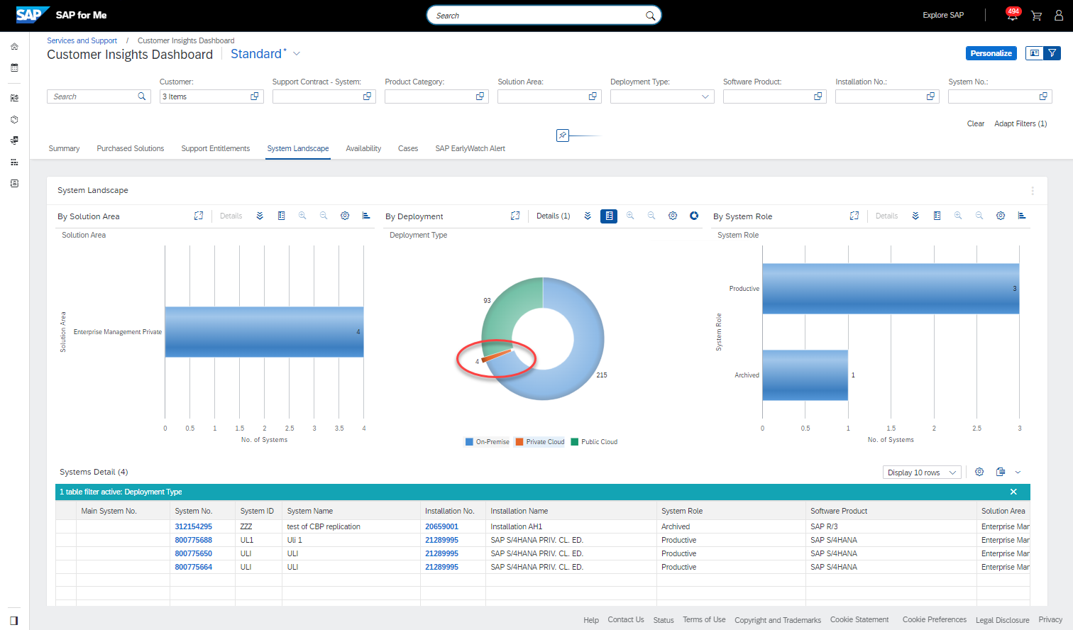
Following 3 graphs are displayed as default:
- All systems grouped by the solution areas to see how many systems are used for which product groups.
- All systems grouped by deployment type to provide how many systems are used as public cloud, private cloud and how many are used as on-premise.
- All systems grouped by the system type to show how many of them are production, how many developments, test, demo etc.
By clicking on a segment in the graph you could immediately see the system details in the table, e.g. to see which systems belong to the private cloud, you can click on the appropriate segment in the deployment-type-graph and both other graphs and the table below would be updated displaying the information for the selected private-cloud systems only.

Private Cloud Systems – Selection
You can easily combine several parameters to find the systems you are interested in.
By clicking on the icon for the “Details” in the graph menu ![]() you can add an additional dimension (additional detail), e.g., deployment model to the existing graph, and so limit the number of systems even more to see only production systems from private cloud, see below:
you can add an additional dimension (additional detail), e.g., deployment model to the existing graph, and so limit the number of systems even more to see only production systems from private cloud, see below:

Graph with added additional dimension
This very flexible data handling allows you to get the information you need very quickly.
There is also additional graph available which is not displayed per default: Systems by Status. To view this graph you go to the “…” menu and select ‘Personalize Card’.

In the next pop up you can switch this graph on.

The 4th graph will appear on the screen.
If you are authorized for many customers (corporate structure) you can also add customer names to the table (screen below). To use the filter for customer numbers you can switch from customer info-card display to the filter display (see other screens).

Systems Overview with all graphs displayed
Table
The table below the graphs displays the details to the graph content and is the basis for the graphical visualization. The table reacts on the selection in the graph and displays only content you have chosen e.g., by clicking on a segment in a bar chart.
The table content can also be customized. Using the customization wheel icon above the table you can add additional fields as columns or remove the fields from the table view. Of cause you can sort, filter and export the table data into excel.
Please use the ‘Feedback’ slider on the right edge of the page of the application to share with us your feedback on this new tool and help us to improve the reporting functionality in SAP for Me.
Stay updated by subscribing to this blog and visiting the SAP Support Portal / Customer Insights.
SAP for Me is made for you!
Related blogs: SAP for Me Goes Reporting
如有侵权请联系:admin#unsafe.sh