Loading...

Internet connections are most often marketed and sold on the basis of "speed", with providers touting the number of megabits or gigabits per second that their various service tiers are supposed to provide. This marketing has largely been successful, as most subscribers believe that "more is better”. Furthermore, many national broadband plans in countries around the world include specific target connection speeds. However, even with a high speed connection, gamers may encounter sluggish performance, while video conference participants may experience frozen video or audio dropouts. Speeds alone don't tell the whole story when it comes to Internet connection quality.
Additional factors like latency, jitter, and packet loss can significantly impact end user experience, potentially leading to situations where higher speed connections actually deliver a worse user experience than lower speed connections. Connection performance and quality can also vary based on usage – measured average speed will differ from peak available capacity, and latency varies under loaded and idle conditions.
The new Cloudflare Radar Internet Quality page
A little more than three years ago, as residential Internet connections were strained because of the shift towards working and learning from home due to the COVID-19 pandemic, Cloudflare announced the speed.cloudflare.com speed test tool, which enabled users to test the performance and quality of their Internet connection. Within the tool, users can download the results of their individual test as a CSV, or share the results on social media. However, there was no aggregated insight into Cloudflare speed test results at a network or country level to provide a perspective on connectivity characteristics across a larger population.
Today, we are launching these long-missing aggregated connection performance and quality insights on Cloudflare Radar. The new Internet Quality page provides both country and network (autonomous system) level insight into Internet connection performance (bandwidth) and quality (latency, jitter) over time. (Your Internet service provider is likely an autonomous system with its own autonomous system number (ASN), and many large companies, online platforms, and educational institutions also have their own autonomous systems and associated ASNs.) The insights we are providing are presented across two sections: the Internet Quality Index (IQI), which estimates average Internet quality based on aggregated measurements against a set of Cloudflare & third-party targets, and Connection Quality, which presents peak/best case connection characteristics based on speed.cloudflare.com test results aggregated over the previous 90 days. (Details on our approach to the analysis of this data are presented below.)
Users may note that individual speed test results, as well as the aggregate speed test results presented on the Internet Quality page will likely differ from those presented by other speed test tools. This can be due to a number of factors including differences in test endpoint locations (considering both geographic and network distance), test content selection, the impact of “rate boosting” by some ISPs, and testing over a single connection vs. multiple parallel connections. Infrequent testing (on any speed test tool) by users seeking to confirm perceived poor performance or validate purchased speeds will also contribute to the differences seen in the results published by the various speed test platforms.
And as we announced in April, Cloudflare has partnered with Measurement Lab (M-Lab) to create a publicly-available, queryable repository for speed test results. M-Lab is a non-profit third-party organization dedicated to providing a representative picture of Internet quality around the world. M-Lab produces and hosts the Network Diagnostic Tool, which is a very popular network quality test that records millions of samples a day. Given their mission to provide a publicly viewable, representative picture of Internet quality, we chose to partner with them to provide an accurate view of your Internet experience and the experience of others around the world using openly available data.
Connection speed & quality data is important
While most advertisements for fixed broadband and mobile connectivity tend to focus on download speeds (and peak speeds at that), there’s more to an Internet connection, and the user’s experience with that Internet connection, than that single metric. In addition to download speeds, users should also understand the upload speeds that their connection is capable of, as well as the quality of the connection, as expressed through metrics known as latency and jitter. Getting insight into all of these metrics provides a more well-rounded view of a given Internet connection, or in aggregate, the state of Internet connectivity across a geography or network.
The concept of download speeds are fairly well understood as a measure of performance. However, it is important to note that the average download speeds experienced by a user during common Web browsing activities, which often involves the parallel retrieval of multiple smaller files from multiple hosts, can differ significantly from peak download speeds, where the user is downloading a single large file (such as a video or software update), which allows the connection to reach maximum performance. The bandwidth (speed) available for upload is sometimes mentioned in ISP advertisements, but doesn’t receive much attention. (And depending on the type of Internet connection, there’s often a significant difference between the available upload and download speeds.) However, the importance of upload came to the forefront in 2020 as video conferencing tools saw a surge in usage as both work meetings and school classes shifted to the Internet during the COVID-19 pandemic. To share your audio and video with other participants, you need sufficient upload bandwidth, and this issue was often compounded by multiple people sharing a single residential Internet connection.
Latency is the time it takes data to move through the Internet, and is measured in the number of milliseconds that it takes a packet of data to go from a client (such as your computer or mobile device) to a server, and then back to the client. In contrast to speed metrics, lower latency is preferable. This is especially true for use cases like online gaming where latency can make a difference between a character’s life and death in the game, as well as video conferencing, where higher latency can cause choppy audio and video experiences, but it also impacts web page performance. The latency metric can be further broken down into loaded and idle latency. The former measures latency on a loaded connection, where bandwidth is actively being consumed, while the latter measures latency on an “idle” connection, when there is no other network traffic present. (These specific loaded and idle definitions are from the device’s perspective, and more specifically, from the speed test application’s perspective. Unless the speed test is being performed directly from a router, the device/application doesn't have insight into traffic on the rest of the network.) Jitter is the average variation found in consecutive latency measurements, and can be measured on both idle and loaded connections. A lower number means that the latency measurements are more consistent. As with latency, Internet connections should have minimal jitter, which helps provide more consistent performance.
Our approach to data analysis
The Internet Quality Index (IQI) and Connection Quality sections get their data from two different sources, providing two different (albeit related) perspectives. Under the hood they share some common principles, though.
IQI builds upon the mechanism we already use to regularly benchmark ourselves against other industry players. It is based on end user measurements against a set of Cloudflare and third-party targets, meant to represent a pattern that has become very common in the modern Internet, where most content is served from distribution networks with points of presence spread throughout the world. For this reason, and by design, IQI will show worse results for regions and Internet providers that rely on international (rather than peering) links for most content.
IQI is also designed to reflect the traffic load most commonly associated with web browsing, rather than more intensive use. This, and the chosen set of measurement targets, effectively biases the numbers towards what end users experience in practice (where latency plays an important role in how fast things can go).
For each metric covered by IQI, and for each ASN, we calculate the 25th percentile, median, and 75th percentile at 15 minute intervals. At the country level and above, the three calculated numbers for each ASN visible from that region are independently aggregated. This aggregation takes the estimated user population of each ASN into account, biasing the numbers away from networks that source a lot of automated traffic but have few end users.
The Connection Quality section gets its data from the Cloudflare Speed Test tool, which exercises a user's connection in order to see how well it is able to perform. It measures against the closest Cloudflare location, providing a good balance of realistic results and network proximity to the end user. We have a presence in 285 cities around the world, allowing us to be pretty close to most users.
Similar to the IQI, we calculate the 25th percentile, median, and 75th percentile for each ASN. But here these three numbers are immediately combined using an operation called the trimean — a single number meant to balance the best connection quality that most users have, with the best quality available from that ASN (users may not subscribe to the best available plan for a number of reasons).
Because users may choose to run a speed test for different motives at different times, and also because we take privacy very seriously and don’t record any personally identifiable information along with test results, we aggregate at 90-day intervals to capture as much variability as we can.
At the country level and above, the calculated trimean for each ASN in that region is aggregated. This, again, takes the estimated user population of each ASN into account, biasing the numbers away from networks that have few end users but which may still have technicians using the Cloudflare Speed Test to assess the performance of their network.
Navigating the Internet Quality page
The new Internet Quality page includes three views: Global, country-level, and autonomous system (AS). In line with the other pages on Cloudflare Radar, the country-level and AS pages show the same data sets, differing only in their level of aggregation. Below, we highlight the various components of the Internet Quality page.
Global

The top section of the global (worldwide) view includes time series graphs of the Internet Quality Index metrics aggregated at a continent level. The time frame shown in the graphs is governed by the selection made in the time frame drop down at the upper right of the page, and at launch, data for only the last three months is available. For users interested in examining a specific continent, clicking on the other continent names in the legend removes them from the graph. Although continent-level aggregation is still rather coarse, it still provides some insight into regional Internet quality around the world.
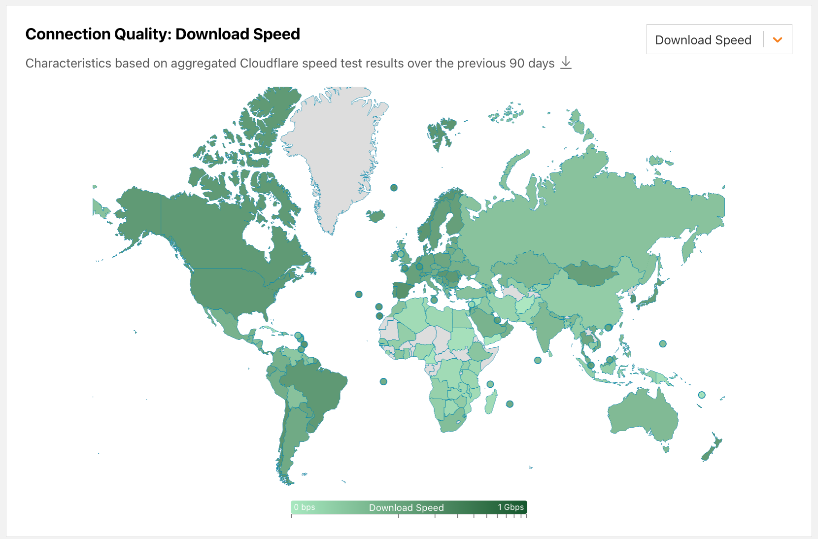
Further down the page, the Connection Quality section presents a choropleth map, with countries shaded according to the values of the speed, latency, or jitter metric selected from the drop-down menu. Hovering over a country displays a label with the country’s name and metric value, and clicking on the country takes you to the country’s Internet Quality page. Note that in contrast to the IQI section, the Connection Quality section always displays data aggregated over the previous 90 days.
Country-level
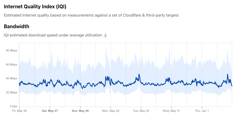
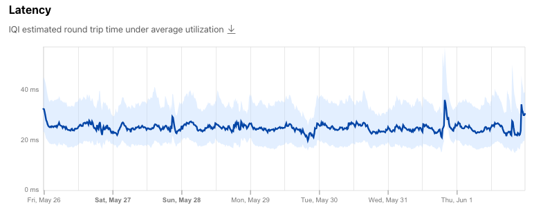
Within the country-level page (using Canada as an example in the figures below), the country’s IQI metrics over the selected time frame are displayed. These time series graphs show the median bandwidth, latency, and DNS response time within a shaded band bounded at the 25th and 75th percentile and represent the average expected user experience across the country, as discussed in the Our approach to data analysis section above.

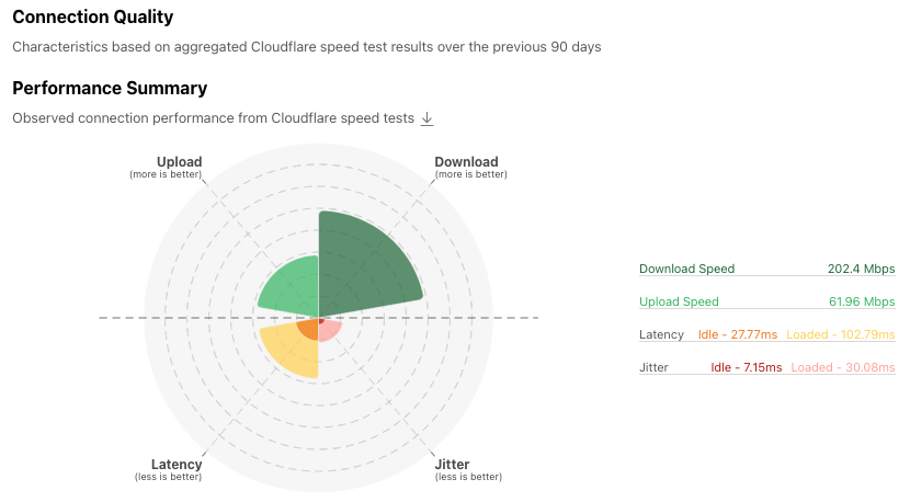
Below that is the Connection Quality section, which provides a summary view of the country’s measured upload and download speeds, as well as latency and jitter, over the previous 90 days. The colored wedges in the Performance Summary graph are intended to illustrate aggregate connection quality at a glance, with an “ideal” connection having larger upload and download wedges and smaller latency and jitter wedges. Hovering over the wedges displays the metric’s value, which is also shown in the table to the right of the graph.
Below that, the Bandwidth and Latency/Jitter histograms illustrate the bucketed distribution of upload and download speeds, and latency and jitter measurements. In some cases, the speed histograms may show a noticeable bar at 1 Gbps, or 1000 ms (1 second) on the latency/jitter histograms. The presence of such a bar indicates that there is a set of measurements with values greater than the 1 Gbps/1000 ms maximum histogram values.

Autonomous system level
Within the upper-right section of the country-level page, a list of the top five autonomous systems within the country is shown. Clicking on an ASN takes you to the Performance page for that autonomous system. For others not displayed in the top five list, you can use the search bar at the top of the page to search by autonomous system name or number. The graphs shown within the AS level view are identical to those shown at a country level, but obviously at a different level of aggregation. You can find the ASN that you are connected to from the My Connection page on Cloudflare Radar.
Exploring connection performance & quality data
Digging into the IQI and Connection Quality visualizations can surface some interesting observations, including characterizing Internet connections, and the impact of Internet disruptions, including shutdowns and network issues. We explore some examples below.
Characterizing Internet connections
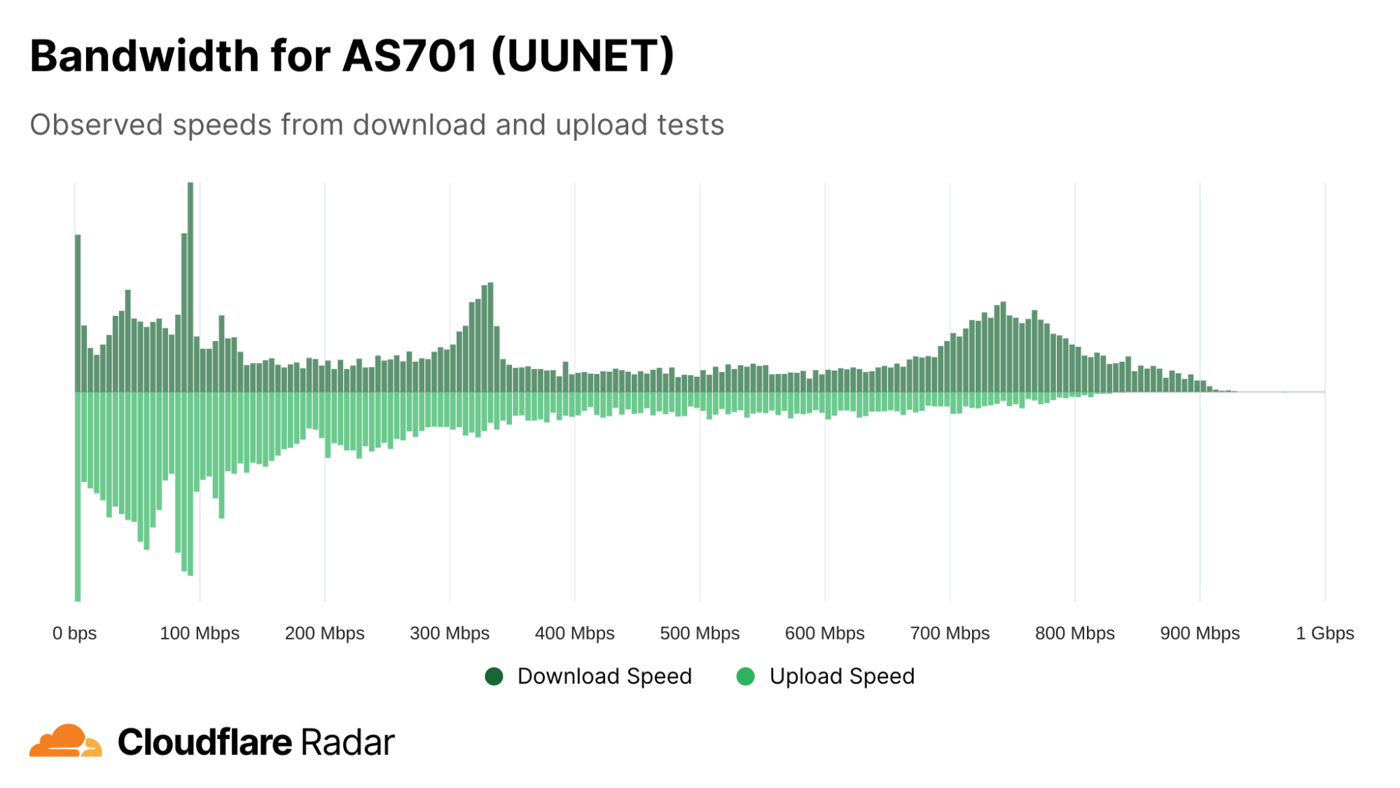
Verizon FiOS is a residential fiber-based Internet service available to customers in the United States. Fiber-based Internet services (as opposed to cable-based, DSL, dial-up, or satellite) will generally offer symmetric upload and download speeds, and the FiOS plans page shows this to be the case, offering 300 Mbps (upload & download), 500 Mbps (upload & download), and “1 Gig” (Verizon claims average wired speeds between 750-940 Mbps download / 750-880 Mbps upload) plans. Verizon carries FiOS traffic on AS701 (labeled UUNET due to a historical acquisition), and in looking at the bandwidth histogram for AS701, several things stand out. The first is a rough symmetry in upload and download speeds. (A cable-based Internet service provider, in contrast, would generally show a wide spread of download speeds, but have upload speeds clustered at the lower end of the range.) Another is the peaks around 300 Mbps and 750 Mbps, suggesting that the 300 Mbps and “1 Gig” plans may be more popular than the 500 Mbps plan. It is also clear that there are a significant number of test results with speeds below 300 Mbps. This is due to several factors: one is that Verizon also carries lower speed non-FiOS traffic on AS701, while another is that erratic nature of in-home WiFi often means that the speeds achieved on a test will be lower than the purchased service level.
Traffic shifts drive latency shifts
On May 9, 2023, the government of Pakistan ordered the shutdown of mobile network services in the wake of protests following the arrest of former Prime Minister Imran Khan. Our blog post covering this shutdown looked at the impact from a traffic perspective. Within the post, we noted that autonomous systems associated with fixed broadband networks saw significant increases in traffic when the mobile networks were shut down – that is, some users shifted to using fixed networks (home broadband) when mobile networks were unavailable.
Examining IQI data after the blog post was published, we found that the impact of this traffic shift was also visible in our latency data. As can be seen in the shaded area of the graph below, the shutdown of the mobile networks resulted in the median latency dropping about 25% as usage shifted from higher latency mobile networks to lower latency fixed broadband networks. An increase in latency is visible in the graph when mobile connectivity was restored on May 12.

Bandwidth shifts as a potential early warning sign
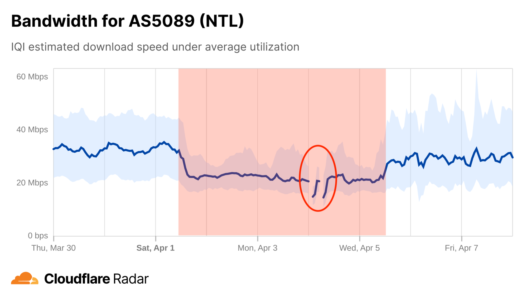
On April 4, UK mobile operator Virgin Media suffered several brief outages. In examining the IQI bandwidth graph for AS5089, the ASN used by Virgin Media (formerly branded as NTL), indications of a potential problem are visible several days before the outages occurred, as median bandwidth dropped by about a third, from around 35 Mbps to around 23 Mbps. The outages are visible in the circled area in the graph below. Published reports indicate that the problems lasted into April 5, in line with the lower median bandwidth measured through mid-day.
Submarine cable issues cause slower browsing
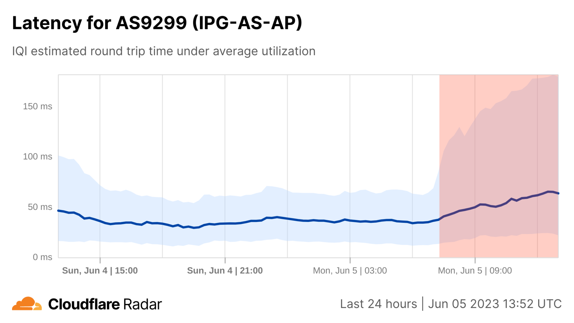
On June 5, Philippine Internet provider PLDT Tweeted an advisory that noted “One of our submarine cable partners confirms a loss in some of its internet bandwidth capacity, and thus causing slower Internet browsing.” IQI latency and bandwidth graphs for AS9299, a primary ASN used by PLDT, shows clear shifts starting around 06:45 UTC (14:45 local time). Median bandwidth dropped by half, from 17 Mbps to 8 Mbps, while median latency increased by 75% from 37 ms to around 65 ms. 75th percentile latency also saw a significant increase, nearly tripling from 63 ms to 180 ms coincident with the reported submarine cable issue.

Conclusion
Making network performance and quality insights available on Cloudflare Radar supports Cloudflare’s mission to help build a better Internet. However, we’re not done yet – we have more enhancements planned. These include making data available at a more granular geographical level (such as state and possibly city), incorporating AIM scores to help assess Internet quality for specific types of use cases, and embedding the Cloudflare speed test directly on Radar using the open source JavaScript module.
In the meantime, we invite you to use speed.cloudflare.com to test the performance and quality of your Internet connection, share any country or AS-level insights you discover on social media (tag @CloudflareRadar on Twitter or @[email protected] on Mastodon), and explore the underlying data through the M-Lab repository or the Radar API.
We protect entire corporate networks, help customers build Internet-scale applications efficiently, accelerate any website or Internet application, ward off DDoS attacks, keep hackers at bay, and can help you on your journey to Zero Trust.
Visit 1.1.1.1 from any device to get started with our free app that makes your Internet faster and safer.
To learn more about our mission to help build a better Internet, start here. If you're looking for a new career direction, check out our open positions.


