Loading...

In January 2021, we gave you a behind-the-scenes look at how we built Waiting Room on Cloudflare’s Durable Objects. Today, we are thrilled to announce the launch of Waiting Room Analytics and tell you more about how we built this feature. Waiting Room Analytics offers insights into end-user experience and provides visualizations of your waiting room traffic. These new metrics enable you to make well-informed configuration decisions, ensuring an optimal end-user experience while protecting your site from overwhelming traffic spikes.
If you’ve ever bought tickets for a popular concert online you’ll likely have been put in a virtual queue. That’s what Waiting Room provides. It keeps your site up and running in the face of overwhelming traffic surges. Waiting Room sends excess visitors to a customizable virtual waiting room and admits them to your site as spots become available.
While customers have come to rely on the protection Waiting Room provides against traffic surges, they have faced challenges analyzing their waiting room’s performance and impact on end-user flow. Without feedback about waiting room traffic as it relates to waiting room settings, it was challenging to make Waiting Room configuration decisions.
Up until now, customers could only monitor their waiting room's status endpoint to get a general idea of waiting room traffic. This endpoint displays the current number of queued users, active users on the site, and the estimated wait time shown to the last user in line.

The status endpoint is still a great tool for at a glance understanding of the near real-time status of a waiting room. However, there were many questions customers had about their waiting room that were either difficult or impossible to answer using the status endpoint, such as:
- How long did visitors wait in the queue?
- What was my peak number of visitors?
- How long was the pre-queue for my online event?
- How did changing my waiting room's settings impact wait times?
Today, Waiting Room is ready to answer those questions and more with the launch of Waiting Room Analytics, available in the Waiting Room dashboard to all Business and Enterprise plans! We will show you the new waiting room metrics available and review how these metrics can help you make informed decisions about your waiting room's settings. We'll also walk you through the unique challenge of how we built Waiting Room Analytics on our distributed network.
How Waiting Room settings impact traffic
Before covering the newly available Waiting Room metrics, let's review some key settings you configure when creating a waiting room. Understanding these settings is essential as they directly impact your waiting room's analytics, traffic, and user experience.
When configuring a waiting room, you will first define traffic limits to your site by setting two values–Total active users and New users per minute. Total active users is a target threshold for how many simultaneous users you want to allow on the pages covered by your waiting room. Waiting Room will kick in as traffic ramps up to keep active users near this limit. The other value which will control the volume of traffic allowed past your waiting room is New users per minute. This setting defines the target threshold for the maximum rate of user influx to your application. Waiting Room will kick in when the influx accelerates to keep this rate near your limits. Queuing occurs when traffic is at or near your New users per minute or Total active users target values.
The two other settings which will impact your traffic flow and user wait times are Session duration and session renewal. The session duration setting determines how long it takes for end-user sessions to expire, thereby freeing up spots on your site. If you enable session renewal, users can stay on your site as long as they want, provided they make a request once every session_duration minutes. If you disable session renewal, users' sessions will expire after the duration you set for session_duration has run out. After the session expires, the user will be issued a new waiting room cookie upon their next request. If there is active queueing, this user will be placed in the back of the queue. Otherwise, they can continue browsing for another session_duration minutes.
Let's walk through the new analytics available in the Waiting Room dashboard, which allows you to see how these settings can impact waiting room throughput, how many users get queued, and how long users wait to enter your site from the queue.
Waiting Room Analytics in the dash
To access metrics for a waiting room, navigate to the Waiting Room dashboard, where you can find pre-built visualizations of your waiting room traffic. The dashboard offers at-a-glance metrics for the peak waiting room traffic over the last 24 hours.
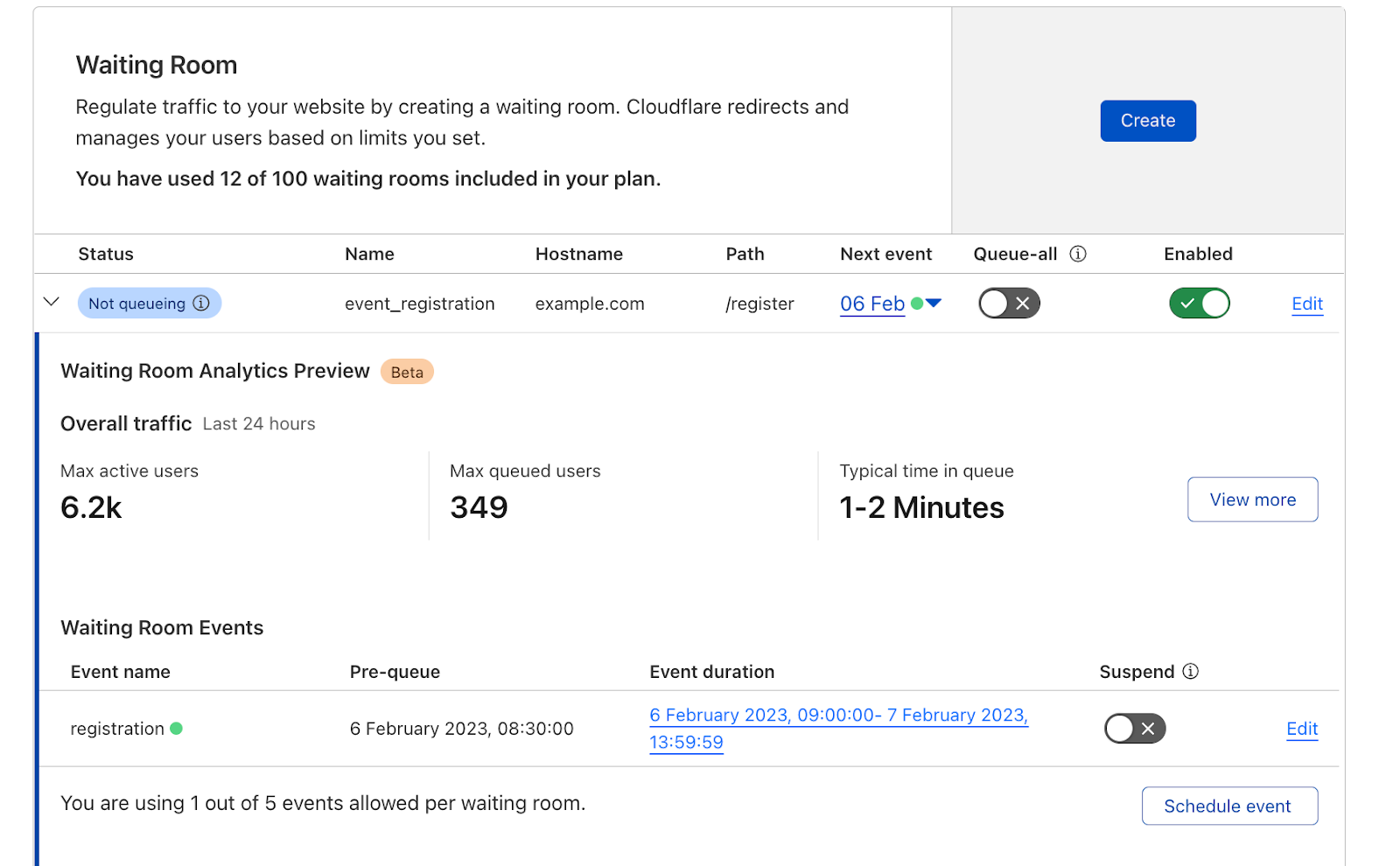
To dig deeper and analyze up to 30 days of historical data, open your waiting room's analytics by selecting View more.
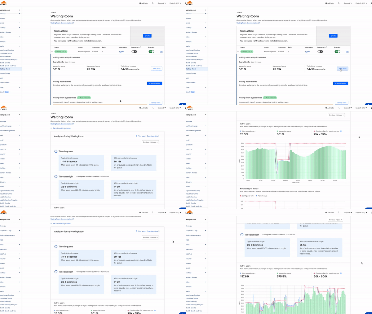
Alternatively, we've made it easy to hone in on analytics for a past waiting room event (within the last 30 days). You can automatically open the analytics dashboard to a past event's exact start and end time, including the pre-queueing period by selecting the blue link in the events table.

User insights
The first two metrics–Time in queue and Time on origin–provide insights into your end-users' experience and behavior. The time in queue values help you understand how long queued users waited before accessing your site over the time period selected. The time on origin values shed light on end-user behavior by displaying an estimate of the range of time users spend on your site before leaving. If session renewal is disabled, this time will max out at session_duration and reflect the time at which users are issued a new waiting room cookie. For both metrics, we provide time for both the typical user, represented by a range of the 50th and 75th percentile of users, as well as for the top 5% of users who spend the longest in the queue or on your site.
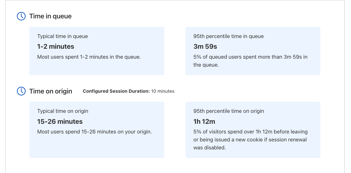
If session renewal is disabled, keeping an eye on Time on origin values is especially important. When sessions do not renew, once a user's session has expired, they are given a new waiting room cookie upon their next request. The user will be put at the back of the line if there is active queueing. Otherwise, they will continue browsing, but their session timer will start over and your analytics will never show a Time on origin greater than your configured session duration, even if individual users are on your site longer than the session duration. If session renewal is disabled and the typical time on origin is close to your configured session duration, this could be an indicator you may need to give your users more time to complete their journey before putting them back in line.
Analyze past waiting room traffic
Scrolling down the page, you will find visualizations of your user traffic compared to your waiting room's target thresholds for Total active users and New users per minute. These two settings determine when your waiting room will start queueing as traffic increases. The Total active users setting controls the number of concurrent users on your site, while the New users per minute threshold restricts the flow rate of users onto your site.
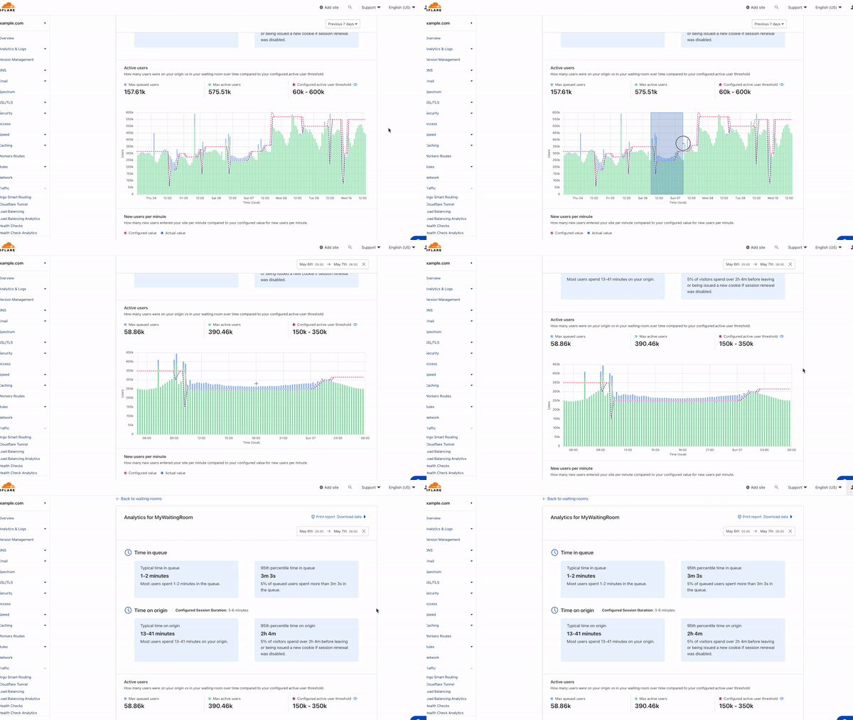
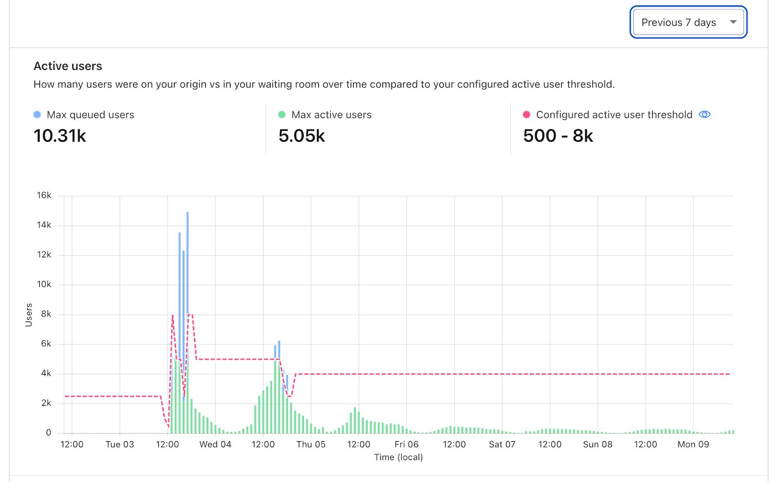
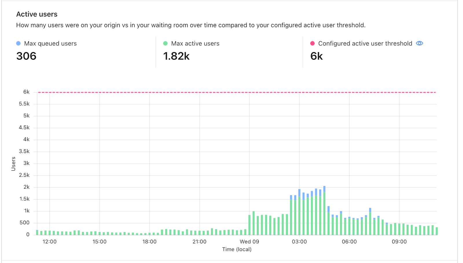
On the Active users graph, each bar represents the maximum number of queued users stacked on top of the maximum number of users on your site at that point in time. The example below shows how the waiting room kicked in at different times with respect to the active user threshold. The total length of the bar illustrates how many total users were either on the site or waiting to enter the site at that point in time, with a clear divide between those two values where the active user threshold kicked in. Hover over any bar to display a tooltip with the exact values for the period you are interested in.
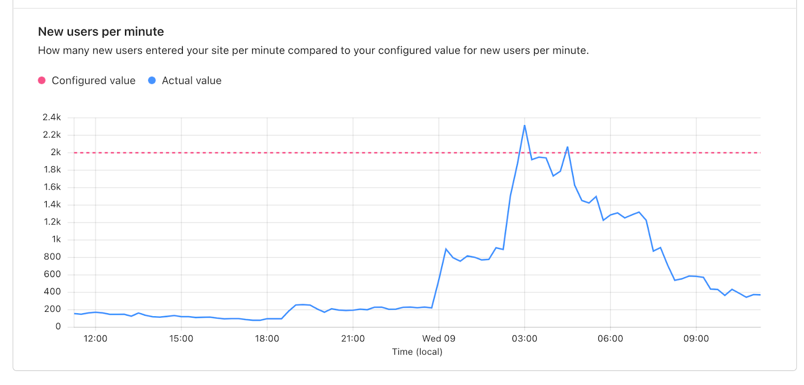
Below the Active users chart is the New users per minute graph, which shows the rate of users entering your application per minute compared to your configured threshold. Make sure to review this graph to identify any surges in the rate of users to your application that may have caused queueing.
Adjusting settings with Waiting Room Analytics
By leveraging the insights provided by the analytics dashboard, you can fine-tune your waiting room settings while ensuring a safe and seamless user experience. A common concern for customers is longer than desired wait times during high traffic periods. We will walk through some guidelines for evaluating peak traffic and settings’ adjustments that could be made.
Identify peak traffic. The first step is to identify when peak traffic occurred. To do so, zoom out to 30 days or some time period inclusive of a known high traffic event. Reviewing the graph, locate a period of time where traffic peaked and use your cursor to highlight from the left to right of the peak. This will zoom in to that time period, updating all other values on the analytics page.
Evaluate wait times. Now that you have honed in on the time period of peak traffic, review the Time in queue metric to analyze if the wait times during peak traffic were acceptable. If you determine that wait times were significantly longer than you had anticipated, consider the following options to reduce wait times for your next traffic peak.
Decrease session duration when session renewal is enabled. This is a safe option as it does not increase the allowed load to your site. By decreasing this duration, you decrease the amount of time it takes for spots to open up as users go idle. This is a good option if your customer journey is typically request heavy, such as a checkout flow. For other situations, such as video streaming or long-form content viewing, this may not be a good option as users may not make frequent requests even though they are not actually idle.
Disable session renewal. This option also does not increase the allowed load to your site. Disabling session renewal means that users will have session_duration minutes to stay on the site before being put back in the queue. This option is popular for high demand events such as product drops, where customers want to give as many users as possible a fair chance to participate and avoid inventory hoarding. When disabling session renewal, review your waiting room’s analytics to determine an appropriate session duration to set.
The Time on origin values will give you an idea of how long users need before leaving your site. In the example below, the session duration is set to 10 minutes but even the users who spend the longest only spend around 5 minutes on the site. With the session renewal disabled, this customer could reduce wait times by decreasing the session duration to 5 minutes without disruption to most users, allowing for more users to get access.

Adjust Total active users or New users per minute settings. Lastly, you can decrease wait times by increasing your waiting room’s traffic limits–Total active users or New users per minute. This is the most sure-fire way to reduce wait times but it also requires more consideration. Before increasing either limit, you will need to evaluate if it is safe to do so and make small, iterative adjustments to these limits, monitoring certain signals to ensure your origin is still able to handle the load. A few things to consider monitoring as you adjust settings are origin CPU usage and memory utilization, and increases in 5xx errors which can be reviewed in Cloudflare’s Web Analytics tab. Analyze historical traffic patterns during similar events or periods of high demand. If you observe that previous traffic surges were successfully managed without site instability or crashes, it provides a strong signal that you can consider increasing waiting room limits.
Utilize the Active user chart as well as the New users per minute chart to determine which limit is primarily responsible for triggering queuing so that you know which limit to adjust. After considering these signals and making adjustments to your waiting room’s traffic limits, closely monitor the impact of these changes using the waiting room analytics dashboard. Continuously assess the performance and stability of your site, keeping an eye on server metrics and user feedback.
How we built Waiting Room Analytics
At Cloudflare, we love to build on top of our own products. Waiting Room is built on Workers and Durable Objects. Workers have the ability to auto-scale based on the request rate. They are built using isolates enabling them to spin up hundreds or thousands of isolates within 5 milliseconds without much overhead. Every request that goes to an application behind a waiting room, goes to a Worker.
We optimized the way in which we track end users visiting the application while maintaining their position in the queue. Tracking every user individually would incur more overhead in terms of maintaining state, consuming more CPU & memory. Instead, we decided to divide the users into buckets based on the timestamp of the first request made by the end user. For example, all the users who visited a waiting room between 00:00:00 and 00:00:59 for the first time are assigned to the bucket 00:00:00. Every end user gets a unique encrypted cookie on the first request to the waiting room. The contents of the cookie keep getting updated based on the status of the users in the queue. Once the end user is accepted to the origin, we set the cookie expiry to session_duration minutes, which can be set in the dashboard, from the last request timestamp. In the cookie we track the timestamp of when the end user joined the queue which is used in the calculation of time waited in queue.
Collection of metrics in a distributed environment
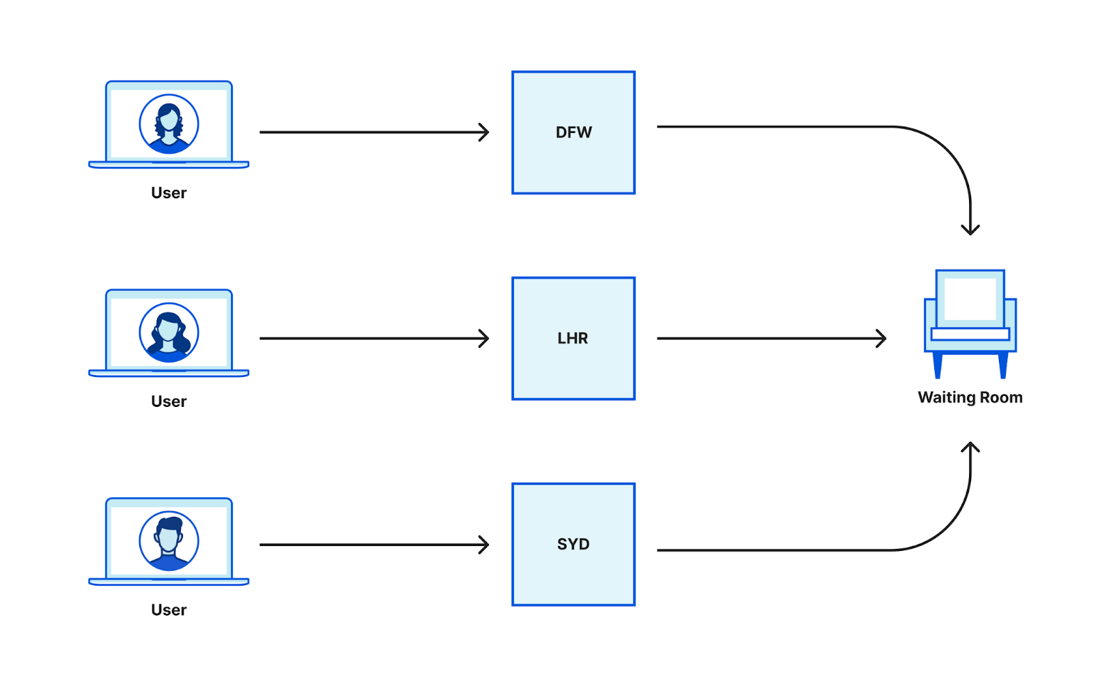
In a distributed environment, the challenge when building out analytics is to collect data from multiple nodes and aggregate them. Each worker running at every data center sees user requests and needs to report metrics based on those to another coordinating service at every data center. The data aggregation could have been done in two ways.
i) Writing data from every worker when a request is received
In this design, every worker that receives a request is responsible for reporting the metrics. This would enable us to write the raw data to our analytics pipeline. We would not have the overhead of aggregating the data before writing. This would mean that we would write data for every request, but Waiting Room configurations are minute based and every user is put into a bucket based on the timestamp of the first request. All our configurations are minute and user based and the data written from workers is not related to time or user.
ii) Using the existing aggregation pipeline
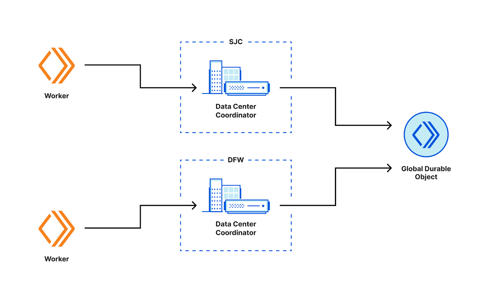
Waiting Room is designed in such a way that we do not track every request, instead we group users into buckets based on the first time we saw them. This is tracked in the cookie that is issued to the user when they make the first request. In the current system, the data reported by the workers is sent upstream to the data center coordinator which is responsible for aggregating the data seen from all the workers for that particular data center. This aggregated data is then further processed and sent upstream to the global Durable Object which aggregates the data from all the other data centers. This data is used for making decisions whether to queue the user or to send them to the origin.
We decided to use the existing pipeline that is used for Waiting Room routing for analytics. Data aggregated this way provides more value to customers as it matches the model we use for routing decisions. Therefore, customers can see directly how changing their settings affects waiting room behavior. Also, it is an optimization in terms of space. Instead of writing analytics data per request, we are writing a pre-processed and aggregated analytics log every minute. This way the data is much less noisy.
Histograms
The metrics available via Cloudflare’s GraphQL API are a combination of configured values set by the customer when creating a waiting room and values that are computed based on traffic seen by a waiting room. Waiting Room aggregates data every minute for each metric based on the requests it sees. While some metrics like new users per minute, total active users are counts and can be pre-processed and aggregated with a simple summation, metrics like time on origin and total time waited in queue cannot simply be added together into a single metric.
For example, there could be users who waited in the queue for four minutes and there could be a new user who joined the queue two minutes ago. However, if we simply sum these two data points, it would not make sense because six minutes would be an incorrect representation of the total time waited in the queue. Therefore, to capture this value more accurately, we store the data in a histogram. This enables us to represent the typical case (50th percentile) and the approximate worst case (in this case 95th percentile) for that metric.
Intuitively, we decided to store time on origin and total time waited in queue into a histogram distribution so that we would be able to represent the data and calculate quantiles precisely. We used Hdr Histogram - A High Dynamic Range Histogram for recording the data in histograms. Hdr Histograms are scalable and we were able to record dynamic numbers of values with auto-resizing without inflating CPU, memory or introducing latency. The time to record a value in the Hdr Histograms range from 3-6 nanoseconds. Querying and recording values can be done in constant time. Two histogram data structures can simply be added together into a bigger histogram. Also, the histograms can be compressed and encoded/decoded into base64 strings. This enabled us to scalably pass the data structure within our internal services for further aggregation.
The memory footprint of hdr histograms is constant and depends on the size of the bucket, precision and range of the histogram. The size of the bucket we use is the default 32 bits bucket size. The precision of the histogram is set to include up to three significant digits. The histogram has a dynamic range of values enabled through the use of the auto-resize functionality. However, to ensure efficient data storage, a limit of 5,000 recorded points per minute has been imposed. Although this limit was chosen arbitrarily, it has proven to be adequate for storing data points transmitted from the workers to the Durable Objects on a minute-by-minute basis.
The requests to the website behind a Waiting Room go to a Cloudflare data center that is close to their location. Our workers from around the world record values in the histogram which is compressed and sent to the data center Durable Object periodically. The histograms from multiple workers are uncompressed and aggregated into a single histogram per data center. The resulting histogram is compressed and sent upstream to the Global Durable objects where the histograms from all data centers receiving traffic are uncompressed and aggregated. The resulting histogram is the final data structure which is used for statistical analysis. We directly query the aggregated histogram for the quantile values. The histogram objects were instantiated once at the start of the service, they were reset after every successful sync with the upstream service.
Writing data to the pipeline
The global Durable Object aggregates all the metrics, computes quantiles and sends the data to a worker which is responsible for analytics reporting. This worker reads data from Workers KV in order to get the Waiting Room configurations. All the metrics are aggregated into a single analytics message. These messages are written every minute to Clickhouse. We leveraged an internal version of Workers Analytics Engine in order to write the data. This allowed us to quickly write our logs to Clickhouse with minimum interactions with all the systems involved in the pipeline.
We write analytics events from the runtime in the form of blobs and doubles with a specific schema and the event data gets written to a Clickhouse cluster. We extract the data into a Clickhouse view and apply ABR to facilitate fast queries at any timescale. You can expand the time range to vary from 30 minutes to 30 days without any lag. ABR adaptively chooses the resolution of data based on the query. For example, it would choose a lower resolution for a long time range and vice versa. As of now, the analytics data is available in the Clickhouse table for 30 days, implying that you can not query data older than 30 days in the dashboard as well.
Sampling
Waiting Room Analytics samples the data in order to effectively run large queries while providing consistent response times. Indexing the data on Waiting Room id has enabled us to run quicker and more efficient scans, however we still need to elegantly handle unbounded data. To tackle this we use Adaptive Bit Rate which enables us to write the data at multiple resolutions (100%, 10%, 1%...) and then read the best resolution of the data. The sample rate “adapts” based on how long the query takes to run. If the query takes too long to run in 100% resolution, the next resolution is picked and so on until the first successful result. However, since we pre-process and aggregate data before writing to the pipeline, we expect 100% resolution of data on reads for shorter periods of time (up to 7 days). For a longer time range, the data will be sampled.
Get Waiting Room Analytics via GraphQL API
Lastly, to make metrics available to customers and to the Waiting Room dashboard, we exposed the analytics data available in Clickhouse via GraphQL API.
If you prefer to build your own dashboards or systems based on waiting room traffic data, then Waiting Room Analytics via GraphQL API is for you. Build your own custom dashboards using the GraphQL framework and use a GraphQL client such as GraphiQL to run queries and explore the schema.
The Waiting Room Analytics dataset can be found under the Zones Viewer as waitingRoomAnalyticsAdaptive and waitingRoomAnalyticsAdaptiveGroups. You can filter the dataset per zone, waiting_room_id and the request time period, see the dataset schema under ZoneWaitingRoomAnalyticsAdaptive. You can order the data by ascending or descending order of the metric values.
You can explore the dimensions under waitingRoomAnalyticsAdaptiveGroups that can be used to group the data based on time, Waiting Room id and so on. The "max", “min”, “avg”, “sum” functions give the maximum, minimum, average and sum values of a metric aggregated over a time period. Additionally, there is a function called "avgWeighted" that calculates the weighted average of the metric. This approach is used for metrics stored in histograms, such as the time spent on the origin and total time waited. Instead of using a simple average, the weighted average is computed to provide a more accurate representation. This approach takes into account the distribution and significance of different data points, ensuring a more precise analysis and interpretation of the metric.
For example, to evaluate the weighted average for time spent on origin, the value of total active users is used as a weight. To better illustrate this concept, let’s consider an example. Imagine there is a website behind a Waiting Room and we want to evaluate the average time spent on the origin over a certain time period, let’s say an hour. During this hour, the number of active users on the website fluctuates. At some points, there may be more users actively browsing the site while at other times the number of active users might decrease. To calculate the weighted average for the time spent on the origin, we take into account the number of total active users at each instant in time. The rationale behind this is that the more users are actively using the website, the more representative their time spent on origin becomes in relation to the overall user activity.
By incorporating the total active users as weights in the calculation, we give more importance to the time spent on the origin during periods when there are more users actively engaging with the website. This provides a more accurate representation of the average time spent on the origin, accounting for variations in user activity throughout the designated time period.
The value of new users per minute is used as a weight to compute the weighted average for total time waited in queue. This is because when we talk about the total time weighted in the queue, the value of new users per minute for that instant in time takes importance as it signifies the number of users that joined the queue and certainly went into the origin.
You can apply these aggregation functions to the list of metrics exposed under each function. However, if you just want the logs per minute for a time period, rather than the breakdown of the time period (minute, fifteen minutes, hours), you can remove the datetime dimension from the query. For a list of sample queries to get you started, refer to our dev docs.
Below is a query to calculate the average, maximum and minimum of total active users, estimated wait time, total queued users and session duration every fifteen minutes. It also calculates the weighted average of time spent in queue and time spent on origin. The query is done on the zone level. The response is obtained in a JSON format.
Following is an example query to find the weighted averages of time on origin (50th percentile) and total time waited (90th percentile) for a certain period and aggregate this data over one hour.
{
 viewer {
   zones(filter: {zoneTag: "example-zone"}) {
     waitingRoomAnalyticsAdaptiveGroups(limit: 10, filter: {datetime_geq: "2023-03-15T04:00:00Z", datetime_leq: "2023-03-15T04:45:00Z", waitingRoomId: "example-waiting-room-id"}, orderBy: [datetimeHour_ASC]) {
       avgWeighted {
         timeOnOriginP50
         totalTimeWaitedP90
       }
       dimensions {
         datetimeHour
       }
     }
Sample Response
{
  "data": {
    "viewer": {
      "zones": [
        {
          "waitingRoomAnalyticsAdaptiveGroups": [
            {
              "avgWeighted": {
                "timeOnOriginP50": 83.83,
                "totalTimeWaitedP90": 994.45
              },
              "dimensions": {
                "datetimeHour": "2023-05-24T04:00:00Z"
              }
            }
          ]
        }
      ]
    }
  },
  "errors": null
}
You can find more examples in our developer documentation.
Waiting Room Analytics is live and available to all Business and Enterprise customers and we are excited for you to explore it! Don’t have a waiting room set up? Make sure your site is always protected from unexpected traffic surges. Try out Waiting Room today!
We protect entire corporate networks, help customers build Internet-scale applications efficiently, accelerate any website or Internet application, ward off DDoS attacks, keep hackers at bay, and can help you on your journey to Zero Trust.
Visit 1.1.1.1 from any device to get started with our free app that makes your Internet faster and safer.
To learn more about our mission to help build a better Internet, start here. If you're looking for a new career direction, check out our open positions.


